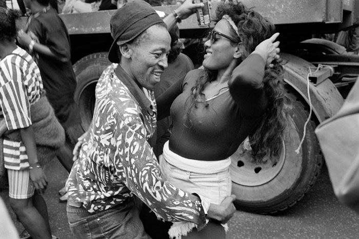
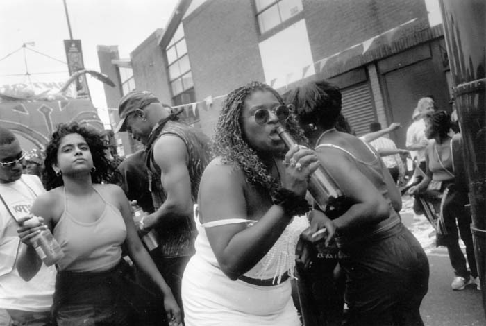
Terry King at 70

Terry King
Terry King reads his poetry at his 70th birthday party

I was surprised to find that Terry King was approaching 70 when I got an invitation to his birthday party on Saturday.

I got to know Terry in the 1970s when we both went to meetings of ‘Group Six‘, a rather controversial group of the Richmond and Twickenham Photographic Society whose interests in photography were largely outside the world of amateur photography with its print battles and sunsets. At the time it was led by another photographer now well-known on the web, Vincent Oliver (then just Vince) whose photo-i web site is the only place to go for reviews of scanners and printers.

Later Terry took over the group, and together we organised a series of shows that got considerably more attention than the main society events, upsetting the committee and we had to set up as ‘Framework‘, an independent photography group outside of the amateur movement. Framework continued to organise shows for a number of years and among many UK photographers to exhibit with Framework were Terry King, Carol Hudson, John RT Davies, Derek Ridgers and Jo Spence. We also had a few foreign contributions.

But Terry is best known for his interest in alternative print processes and his personal work using them, particularly gum bichromate and the ‘Rex’ variations he developed for gold printing and cyanotype.

Around 30 years ago, I sat in a row on the left-hand side of a dimmed hall in Richmond listening to a lecture by a retired advertising photographer called Steinbock. On my right was Terry King and on my left, Randall Webb (much later to become the co-author with Martin Reed of ‘Spirits of Salts:  A Working Guide to Old Photographic Processes‘  London:  Argentum, 1999.) The small and rather tonally lacking gum prints which the lecturer put on display were not the first I had seen, but this was the first time I had seen a gum printer and been told with some detail how to make such prints.

The three of us went away, each determined to try the process. At the time I was a teacher of chemistry and photography, and liberated a couple of surplus jars of the potassium dichromate needed from our chemical store and gave one to Terry.

Later I helped Terry who had set up a course ‘From Wedgewood to Bromoil‘ so he could get paid while he tried out early photographic processes at the local adult education institute.  I got my college to pay my fees for the course and we spent a year of Saturday mornings with a few other keen students learning how to do pretty much the whole range of alt processes, with William Crawford’s ‘The Keepers of Light‘ as our main guide.

I found gum a pain to work with, especially when I tried tri-colour printing, and soon concentrated on other processes such as salt-printing, kallitype and platinum and palladium, teaching a few classes and workshops, but eventually my other photographic interests left no time alt printing.  In any case, once most alt printers had started to work from digital negatives I felt they may as well go the whole way and make inkjet prints.

Terry went on to develop his own individual approach to gum printing, producing many fine images (one of which normally hangs on my wall, and you can find some examples on his web site)  with this and other processes, as well as to run workshops that trained a whole new generation of alt photo printers in the UK, to organise the international APIS (Alternative Processes International Symposium) and various other events, as well as becoming Chairman of the Historical Group of the Royal Photographic Society.

Terry is also a poet, and in particular has produced many inspiring limericks. Long ago when he was a civil servant he used to compose at least one every morning on his train journey from Twickenham to Waterloo. The photograph shows him reading some short poems shortly before blowing out the candles on his cake.

Bronx Boy John Benton-Harris examines the validity of Frank Gohlke’s “Where We Live”

‘Where We Live – Queens, New York 2003-4’,
Howard Greenberg Gallery, New York, 27 June-22 Aug 2008

As someone as long in the tooth as Mr Gohlke, and involved just as long as he in communication through seeing, I feel I have both the right and the obligation to speak of this show, and what I feel are its merits and failings. And as I sense its overall merits are few, and its failings great, I’ll deal with the former first.

The 40 plus prints exhibited (mostly horizontal) are large and very large by the standards of a documentary photographer of his age and type, and far too big for the smallness of their content. So why he would want to draw our attention to this view of Queens is beyond my comprehension, especially after the gallery handout stated: “Queens is both a destination and a way station, where ethnic diversity first undergoes the turbulent process of Americanization.”.

Well, looking at this show, I would have to challenge that remark, for there is no sign of habitation, let alone a piling up of people awaiting assimilation, neither is there anything chaotic, untidy, or frenzied about these images that would suggest this process, singularly or en masse. Indeed for Mr Gohlke to gain a chance to capture anything of it, he would have had to take the risk of working in a less affluent, more borderline neighbourhood. That way, he could easily show us these same nice tidy homes adjacent to or juxtaposed against failing light-industry, foreign greengrocers, new Irish pubs, Indian news agents, graffiti, abandoned cars, and possibly even sneakers dangling from tied shoelaces hanging from a spaghetti of overhead cables. And all manner of other signs of change and cultural clash, that are easily and abundantly available, if one chooses the right locality, and focuses an appropriate mindset to illustrate transition.

These images are more like advertisements than anything to do with social commentary or the art of thoughtful seeing, and that having been said, I believe they would be better placed in an Estate Agent’s window than on a gallery wall.

So I’m thinking whoever wrote the PR for this show was doing it without access to the images, while Mr Gohlke was out doing some simple stock-taking with his camera in a part of Queens that looks more like the place where we would find “Stepford Wives” residing than any area in the process of great social and ethnic turmoil. The only kind of reading these observations project is the neutrality and economy of a quantity surveyors list. A list of different types and kinds of required bricks, railings, fences, doors, sidings, windows, awnings, bushes, trees, shrubs, and flower beds. All that seems to be missing here is the costings of all these different home and garden accessories, so if they celebrate anything at all, it seems to be “Home Depot“, or some such other like place.

As someone who is a veteran walker of this city, I know where to look for what “Where We Live” promised but didn’t deliver, because I’ve explored a number of such confused and contrasting areas of this borough and the other four. So I know from experience all that just mentioned is indicative of this kind of turbulence, and is very gettable, as long as one commits the necessary thought, time and effort.

But I suspect he’s a contented one-way approach person, and will carry on snapping stylistically as he always has, leaving any sign of personal reading in or across his imagery to others, as well as any accompanying text. And that will always get him into deep shit with people who can read image/text and text/image, for his promises remain undelivered.

However, on the plus side, as this kind of graphic wall furniture goes, they are beautifully finished and presented, as is the standard of Howard’s gallery. But Mr Gohlke’s commitment here is merely to shape-up on this dull neighbourhood, that at best reveals an abundance of poor taste, made taut through simple juxtaposition. And to think it took him two years to bring into being this small graphic exercise. Even more astonishing to me is that it should get an outing off campus, let alone at a major New York Gallery.

But to be kind, and to also to encourage the photographer to go back and give the subject suggested in the text another try, I did happen to notice here and there a few barred windows and the occasional front door that resembled a small town bank vault. So maybe his mind was beginning to kick in with a little, but too late. From his CV, he seems like a guy who knows how to get access to funding, so if he doesn’t feel “he’s already done it and there is a next time, this could be a start point. He might consider trying to let us know something about those who live there, as I listed earlier. Such as what the inhabitants drive, where they eat and shop, anything that would help to warm up Mr Gohlke’s precision and economy, so we are motivated to look again.

At this juncture he simply gives us access to what we can easily see for ourselves if we venture past those houses, and down those streets. So I must pose the question – “Does this view of Queens really deserves great praise?  Yes indeed it does, but only if we were tragically all born blind, and these observations were printed in Braille, then we could all feel our way around the gallery walls, and be amazed.

© John Benton-Harris14 August 2008

Web Links

Howard Greenberg Gallery
Frank Gohlke

The Plot Thickens: Nikkor 18-200mm VR

Having just spent a couple of weeks with this as virtually the only lens on my camera, I’m beginning to sort out my thoughts about it and it may help me (and possibly others) to set them down.

I thought it would be helpful to me to start by analysing which focal lengths I really used – at least for my more successful pictures. These are the images that I have bothered to develop from the original RAW files to save in my personal library as full-size high quality (92% in Lightroom) jpegs. Although I archive most of the RAW NEF files I shoot, these jpegs are my working collection of images.

For this analysis I used a small freeware program written by Paul van Andel, ExposurePlot and set it to examine all the sub-folders in my August 2008 directory, which contain 899 images. Of these, 34 were taken with the 10.5mm fisheye (a small but very important proportion which could not have been made otherwise) and the remaining 865 with the 18-200mm.

Lens use
Too small to read! The left hand bar is the 10.5mm fisheye. Other bars represent the number of images grouped around 30mm, 60mm etc to 300mm.

The results were interesting – and of course could be very different to those of other users. Almost exactly two thirds (66.8%) of the images were taken in the range 18-33mm (equivalent 27-50mm) with  38% with the lens at or very close to its widest setting. Around 10% were in the 70-90 mm equiv range, 8% in the 100-160mm range and around 11% at 180-300 equivalent, of which half were at the 300mm setting. The table (made with a little help from Excel) gives the fuller picture.

August images with Nikon 18-200 VR

Focal length
Actual  35mm Eqv  Frames  Cum Frames  Cum %
18       27        329        329       38%
20       30         84        413       48%
27       40         86        499       58%
33       50         79        578       67%
40       60         14        592       68%
47       70         27        619       72%
53       80         43        662       77%
60       90         19        681       79%
67      100         10        691       80%
73      110         18        709       82%
80      120         13        722       83%
90      140         18        740       86%
107     160         14        754       87%
113     170          4        758       88%
120     180          8        766       89%
133     200         14        780       90%
153     230         13        793       92%
173     260         18        811       94%
200     300         54        865       100%

So with an 18-70 I could have taken 80% of these images, or with an 18-125mm roughly 90%. But the large number of images at the widest setting also suggest that I really would have preferred something a little wider (and yes, I do feel that when shooting – which is why my full kit also includes a 10-20mm.) I also have a suspicion that I wouldn’t really miss some of those that I took at or around the 200mm setting.

If the guys at Nikon  (or Sigma, Tamron etc) are listening, what I’d really like for a super-zoom is something like a 15-100mm lens. Perhaps the closest at the moment are the Sigma 17-70mm f/2.8-4.5 DC Macro / HSM, which is also reasonably small – almost exactly the same size as their 18-125 OS, another contender, along with Nikon’s own 18-70mm and the Tamron 17-50mm f/2.8 SP XR. Nikon also have a classy but big and heavy 17-55mm, a good lens but not for going light.

So what do I think now of the Nikon 18-200 VR? (This isn’t exactly a review – for a rather more balanced view on this and other Nikon lenses I recommend Thom Hogan.)

Its plus points are obviously its size and weight, impressively small for a lens with such a large range, but just a little big and heavy for the holidays. And there is the VR, though I’ve never been that convinced it did anything for most of my pictures (of course it doesn’t help with moving subjects.) I keep it switched on, but I’ve no idea if it helps or not.

It’s also a reasonably sharp lens, usable at full aperture when you have to (though better stopped down – like almost all lenses.) But that’s true of most modern lenses and it generally takes resolution charts rather than typical subjects to show up their weaknesses.

On the down side, it’s big enough to make the flash built in to the camera useless unless you like a big area of shadow at the bottom of every shot, at least around the wide-angle end (slightly better if you remember to remove the lens hood.) Almost every picture needs correction for chromatic aberation for critical use, and again for architectural shots, horizons etc you need to correct for barrel or pincushion distortion. Fortunately Lightroom handles the chromatic stuff easily (the camera can do it automatically for jpegs and the Nikon raw software also handles the job, but I can’t cope with its workflow.) And  ePaperPress’s PTLens is a real bargain and does a great job when those lines need to be straight.

It’s not a perfect lens, but I can live with these problems. But what has caused me considerable pain is autofocus. Perhaps I’ve just been unlucky, or it may be that the build quality of this lens isn’t up to my lack of care with equipment. But too often I’ve half-pressed the shutter to focus and it fails to do so. I took it in for service earlier this year and it improved a bit, but on holiday it was back at it’s old tricks. Yet when writing this article I tried it out and it was perfect.

This kind of intermittent fault is a real pain, both for the user and the repairer. Fortunately for me even when it’s at its worst it still focuses at the extreme ends of the zoom range, just not anywhere in between. As the graph shows I use it most around the ends, and I’ve got into the habit of focussing there and then holding the release half-down while I zoom back to take the picture. But sometimes the delay involved has led to my missing the critical (or even perhaps decisive) moment.

Busman’s Holiday?

What do you do about taking pictures when you take a holiday? Many, particularly amateurs, see their holidays as one of the main opportunities for taking pictures (and when long ago I used to belong to camera clubs I would groan, usually inwardly, to see yet another picture of Windermere or Switzerland flash up on the screen or appear on the wall.)


Iona: Another holiday snap!

But as someone whose life revolves around photography, if I take a holiday I want to at least distance myself slightly from the normal round and relate at least a little more normally with the people I’m on holiday with. Much as I enjoy and am involved with it, making decent and meaningful pictures is hard work, demanding a high level of concentration, and I am often pretty mentally exhausted at the end of a busy day. Once in a while I feel I need a rest.

So there are times – days, possibly even weeks (though I can’t remember one) where I don’t take any pictures at all. But on holiday I often come across things I’d like to at least record in some way by taking a few snaps – and sometimes rather more. My companions almost certainly still think I’m obsessed with photography (and they are probably right) but it is a matter of degree. Time after time in the last couple of weeks when I was away on holiday I didn’t go down the street, didn’t cross the road, didn’t go and talk to the person I would have approached had I been photographing seriously.


Some companions on a pilgrimage on Iona relax at the marble quarry.

Often when I’ve travelled for reasons other than to work as a photographer I’ve travelled light, often taking only a simple compact camera. Generally I’ve come across situations where I’ve regretted not having a better camera for various reasons, and digital has added to that dilemma. With film, the quality of the results from a 35mm compact with a good lens was identical to that from an large and expensive SLR (or sometimes with wide angles, even better) while the same just isn’t the case with digital.

I’d hoped that the Leica M8 would present me with an reasonably compact solution – if at considerable expense. With a fast f1.4 lens it was certainly fun to use, particularly at night in Paris, but in general it’s been a disappointment, though if I could afford them, some new lenses might help. But over the past few years I’ve become so used to using zooms that it’s a hardship to be without one.

Staffa - Fingals Cave
Fingal’s cave, Staffa – one place where a real wide-angle helped

So this summer I travelled with the Nikon D300, but with a considerably cut-down kit. Even so, 2 lenses (the moderately large 18-200mm VR and the miniscule 10.5mm semi-fisheye) and an SB800 flash although a very flexible outfit isn’t exactly light and compact, and at times the gear did get a little in the way. Next time I’d certainly opt for a smaller lens, perhaps an 18-50mm, which would also enable me to rely on the camera’s own flash.

Of course what I’d really like would be a compact digital with no shutter lag, a large sensor and a a zoom lens with something like 24-85 equivalent.  It doesn’t seem an impossible specification, but nothing yet approaches it. In fact it might even replace my Nikon for work.

I’ll doubtless put more of my holiday pictures on line shortly, both from Glasgow and Iona.  A few of them show that I was occasionally able to think as well as press the shutter.

Harry Benson – Let Glasgow Flourish!

Harry Benson – A photographer’s journey

Friday 30 May 2008 – Sunday 14 September 2008
Kelvingrove Art Gallery and Museum, Glasgow

People who know me won’t be one jot surprised to learn that Glasgow is my favourite Scottish city – though Edinburgh’s nice enough, and as Irvine Welsh reminds us, in particular Leith has its moments.

And although Harry Benson’s glittering career working for the major news magazines took him to London and New York which is now his home, it is clear from his photographs that his native city is where his heart still lives.

His large and interesting show at the Kelvingrove until September is worth a visit, not least for another chance to view the TV program on show there where Benson talks about his work, and is shown taking pictures in the city and around. You can see at least most of the pictures from the show (and some others) on his web site – with around 30 pictures from Glasgow which includes a portrait made with the giraffe and Spitfire in the art gallery itself.

Benson is the kind of press photographer who makes a career of setting up his subjects – often the rich and famous (including every US president since Eisenhower) – to perform for his camera. Were I ever to try to cover an event at the same time as him I can imagine he would leave me fuming , one of those guys who feels he has to organise things. At one point on the film he says something like if you just take pictures of people as they are they would look boring, so he gets them to jump in the air or something. But equally I’m sure he would be a fascinating guy to talk to in the pub afterwards.

In the end its his own pictures that provide the best argument against what he says. For me the strongest work in the show – or on his web site – isn’t the organised images of celebrities (though you can surely see why they have been so popular with editors and readers alike) but the pictures from the streets of Glasgow where he has taken things as they were. Beside his pictures of the boys at the Stewart Memorial fountain (a short walk from the gallery) or the couple of girls in front of graffiti playing with the city motto his pillow fighting Beatles are empty, meaningless decoration, however nicely done.

Like I say, Glasgow rather than Edinburgh.

Kelvingrove


River Kelvin and Kelvingrove Art Gallery

Glasgow’s Kelvingrove Art Gallery. is a gallery I can whole-hardheartedly recommend with a fine collection of paintings and other objects.

My companions and I differed in our opinions of the ‘Glasgow Boys‘, whose contribution to art in the 1880s and 90s deserves to be better known, but the gallery has a superb collection of French painting, although unfortunately too many works were absent on loan, some in Edinburgh for a joint show, ‘Impressionism & Scotland‘ which comes to Glasgow later in the year. I don’t like these big collected shows – much better I think to see the works a few at a time, but having paid your £8 you feel obliged to slog round all hundred and something of them.

The gallery (entry is free)  also has a fine display of work by C R Mackintosh and friends  – rather more authentic than in most tea-rooms and certainly than the ‘Rennie Mackintosh’ hotel I was staying in. (Like W H F Talbot, Mackintosh seems almost always saddled in the popular mind with his middle name.)  It also made clear how much his work relied on that of sisters  Frances and Margaret Macdonald, which I found more interesting than his. Good though buildings such as the ‘School of Art’ are, I find a little Mackintosh goes a very long way.

It’s also a great place for kids, and there were a lot enjoying it while we were there on a wet August morning. What other museum can boast both a Spitfire and a giraffe?

(Also showing at the Kelvingrove Art Gallery were photographs by  one of its most illustrious photographer sons, Harry Benson – which I write about separately.)

John Benton-Harris – “a son of the beach” – looks at Joseph Szabo’s “Jones Beach”

Michael Hoppen Gallery, London (1 August – to -19 September)

It takes courage to be a leader, instead of simply playing it safe by being yet another follower, just as it’s refreshing for us, not to gaze upon works by people who’ve been over-celebrated and over-marketed. But sadly Mr Hoppen’s courage isn’t quite enough; it also takes the ability to differentiate between imagery that is adequate, or even good in editorial terms, and seeing that goes way beyond familiar observations of everyday existence.

However, imagery that take us to this new plain of awareness is always the by-product of those who take the trouble to know this history, and also something about their subjects and those earlier eyes that contributed to both. Sadly Joseph Szabo’s love affair with Long Island’s Jones Beach has more the look of a voyeur then someone engaged in a fine romance.  He, as this imagery states (excuse the clumsy metaphor) has been operating in the dark while he’s been out there basking in the sunshine of this subject. So as adequate as these first images looked on paper, as illustration, they do not pass muster as notable examples of fine art, on a gallery or museum wall.

And when I first caught sight of his Jones beach snaps while flipping through a copy of a recent Sunday supplement, the thought that came to me was something Walker Evans wrote (for a show of his work at MoMA in 1956 – quoted in full in “Walker Evans and Robert Frank: An Essay on Influence”, Tod Papageorge, Yale University Art Gallery, 1981) in regard to where he believed “Valid photography” could not to be found; after listing several unlikely spots, he concluded – “under no circumstances is it anything ever anywhere near a beach.”

Looking at these images without the benefit of my knowing of my medium and its achievements, I might well agree with Walker’s prejudice. But since I have this knowledge and openness, I can also see what Mr Szabo’s simple approach denies him: a message or opinion to deliver; a desire to entertain; a determination to seek and capture what has not been previously seen; and a talent for invisibility.  Understandably all this allows, even demands, that I be under-whelmed by Mr Szabo’s shoot, and Mr Hoppen’s choices, as well as Mr Evans’s words, when it comes to understanding what the beach has to offer.

At this point, I must confess I haven’t yet seen the complete show, only the synopsis of it. But having experienced Mr Hoppen’s disregard for fact, his poor visual sensitivity tells me he’s simply looking here to sell lower priced works, to gain some advantage from the recent down-turn in the photographic market.

Well, now that I’ve seen the “whole tamale”, I’m left feeling that the additional 30 images only devalued his smaller view, for it became clear that the diversity that was hinted at in the first eight images that illustrated his “DAYS OF SUNSHINE AND POSES”  revealed more about him then his subject. Snap, after snap, after snap, this beach was used as his premier place for watching “dolls strutting their stuff”, mixed in amongst a few muscle flexing Adonises. If Joseph truly wants us to be taken seriously (by me at any rate) he needs to stop letting little Joe point the way, and also attempt to look beyond the reach of his lens, for a contact that strives to go beyond the best – and nothing of that is to be gleaned in this display of beach trekking

The variety hinted at in the small editorial advertisement for this show was never delivered, but a diversity of sorts was to be found; it was in the prices asked, which ran from £790 for an 11 x 14 inch print to as much as £8289 for something near 2 by 4 feet. So I must admit, I got Mr Hoppen’s motivation wrong, it was not after all about a show at a lesser cost to everyone, it was about giving us an “AMERICAN FANTASIST” to follow in the wake of his first “AMERICAN FICTION” – “The New York School” – his last American offering.

So thinking there might also be a fictional aspect to this show as well, I took one last look around these 36 exhibited prints, to make sure there weren’t any from Brighton, Ramsgate, Margate or Scarborough, by another true “son of the beach” like myself, that could more justifiably be connected to either of these poorly represented and distorted offerings.

© John Benton-Harris – 6 August 2008

More Pictures on My London Diary

Holidays have rather disrupted my postings to this site and also My London Diary over the last couple of weeks – one spent in Glasgow and the second in Iona.  It is possible to connect to the Internet in both places, but the hotel I stayed in on Renfrew St was in the 1980s and the Abbey on Iona medieval in terms of communication. Anyway I wanted a rest away from it all, though that didn’t stop me using a digital camera.

Given the low cost of CF cards at the moment, it’s hardly necessary to take a computer away on holiday, and the market for portable hard disk devices must have plummeted.  I did in fact take my notebook, as I wanted to be able to show my presentation and work from Brasilia to some of the people I was to meet in Iona, but in future I’ll perhaps travel light with a few 8Gb cards.

Of course it is good to be able to see what you are doing on a larger scale than the camera display while your away – and to share them, and at around 3.5 lbs my notebook isn’t a huge weight to carry – and there are smaller, lighter models now.

I’ve still not had a good look at the holiday snaps, and many will be more of interest to family and friends than a wider audience, but I expect I’ll put at least a few on line. But my priority on getting home was to get the pictures from before I went away  onto My London Diary (and deal with those 1500 or so waiting e-mails.)

No New Coal
The march forms up to go to Kingsnorth for the Climate Camp

The No New Coal Rally and March pictures are now available as well as those from the Hayling Island Carnival

Hayling Island (C) Peter Marshall

Collecting on the Cheap

I first came across Jen Bekman in 2003, when she started a small gallery in New York in 2003 and curated a show (the third at the gallery) ‘made in ny‘, a mixed show that included work by Mitch Epstein and other photographers along with street art and “works on paper” (also what most photos are printed on!) but what really brought her to my attention was the international photo competition, Hey, Hot Shot! which she started a couple of years later. This describes itself as “The best thing going for emerging photographers” and it is certainly worth considering an entry, though you have missed the latest of these now semi-annual events, which closed on June 17, and you can see the Hey, Hot Shot! 2008 – First Edition Winners on the blog along with pictures from some other entrants, and, until Aug 23 at the Jan Bekman Gallery in NY.

The two photographers who interest me most among the five winners are Kate Orne and Colleen Plumb, but all of the winners and those of the 20 or so ‘Honorable Mentions’ I’ve looked at have some fine work – this is a tough competition.

Entering Hey, Hot Shot! is also how photographers approach Bekman’s latest venture, 20X200 which is based on a simple formula:

large editions + low prices x the internet = art for everyone

Each week two new art works come on sale, one of them a photo, available in 3 sizes. The smallest size (on 8.5×11″ paper) is in an edition of 200 and sold for just $20, hence the site name (though mailing to the UK more than doubles the price), with a medium size print (17×22″ paper) at $200 – edition 20 – and a larger print (30×40″ paper) at $2000 in an edition of 2.

Some of the $20 editions – which go on sale online at 2pm EST on Tuesdays and Wednesdays (which I think makes it 7pm in the UK) – sell out in a few minutes, but others are slower sellers, and there were 20 of the $20 photos still available when I looked at the site, and a great choice of the more expensive editions – though $200 is still cheap looking at current market prices.

If you are interested, you can sign up for free on the 20X200 site and get advance notice of future editions. I think this is a great idea, although the delivery cost for those not in the USA makes it considerably less attractive.

You can of course buy low cost prints of some of the classic works of photography from the Science and Society Picture Library.  Their prints are not editioned and come from the Science Museum, National Railway Museum and the National Museum of Photography, Film & Television which includes the Royal Photographic Society Collection, one of the best collections of the first 100 years of photography in the world. Prices are extremely reasonable and print quality sometimes rather better than that of vintage prints. You can buy some really iconic photographic images- if you’ve always wanted a print of Alfred Stieglitz’s ‘The Steerage’ it’s yours for £7.50 at around the correct size.

LIbrary of Congress- Walker Evans
Walker Evans, Auto parts shop. Atlanta, Georgia. 1936
Library of Congress  (available as 20Mb Tiff)

Cheaper still is the Library of Congress. Its pictures are also available as prints at low cost, but you can also download some as high quality scans for free and make your own prints  – which can be better than the originals. Only a limited selection of the work is available as high quality TIFF files, but it does include a number of pictures by Walker Evans to name just one of my favourite photographers.

Prison Justice – Paula Campbell

Prison Justice Day, August 10, started in Canada in the 1970s.  On August 10, 1974, Eddie Nalon bled to death in solitary confinement, and on that day a year later prisoner in the jail held a one-day hunger strike and a memorial service – and were themselves put in solitary for doing so. By August 10, 1976, there were two deaths being remembered by the prisoners, and thousands of prisoners in jails across Canada took part in a hunger strike, with Prison Justice Day Committees in Quebec, Ontario and British Columbia organising events in the outside community.

In 1983, prisoners in France joined in, calling for the day to be an international event and by the mid 1990s those in Germany, England and the US were also involved. You can read the details of the history on the Prison Justice web site.

In this country, one of the best known campaigners for justice in our prisons was Pauline Campbell. After the death of her daughter in Styal Prison in 2003, she put all her considerable energy and organisational skills into a constant campaign against deaths in prison. I first met her later that year in Trafalgar Square at the annual United Friends and Family Campaign Remembrance demonstration, where her story moved me to tears.


Pauline Campbell speaking  in 2003

I photographed her on several occasions after that and got to know her rather better this January at a protest outside Holloway jail in London, in memory of Jaime Pearce, a 24 year old who died there the previous month, aged 24, the eighth woman to die in jail in 2007. From then on – like many journalists – I received regular emails from her about her protests, as well as frequent personal messages about my own work.

Pauline assaulted
Pauline Campbell assaulted by a police officer outside Holloway, Jan 2008

Like others who knew her I was deeply shocked (but not surprised) at the news of her suicide at her daughter’s graveside in May this year. So I was sorry to miss the demonstration for Prisoner Justice Day organised by the group No More Prison outside HMP Styal on August 10 to show solidarity with women in prison and pay tribute to Pauline Campbell, who we remember as a fearless campaigner and a remarkable person.