I try not to get obsessive about the police. We need a police force of some kind, and some of the things that they do I’m thankful for, even though there are other things that I condemn. I’ve been rather glad that they were there when people have threatened to smash my cameras as I photographed them, or when a right wing crowd moved rather menacingly towards me. And there have been many other occasions when they’ve acted sensibly and professionally, as well as those others where their actions seem arbitrary and senseless. And at times downright criminal.
Of course I’ll try to photograph them when they behave badly, but equally I do my best to photograph when others attack them. But mostly I’m not at events to photograph the police except as they get themselves involved with those taking part.
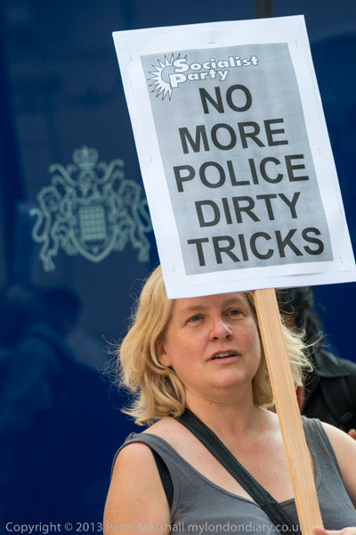
But I was photographing a protest Against Undercover Police in Protests which was about police behaving badly. Police posing as protesters, living a life undercover infiltrating groups involved in legal protest. At times trying to persuade other protesters to engage in illegal acts, or starting and encouraging trouble at otherwise peaceful protests. Pretending to fall in love with other protesters – and some fathering children by them. Taking the names of dead children to produce fake identities.
Other operations like deliberately setting out to try and discredit witnesses such as Duwayne Brooks; beating up people who they claim are resisting arrest; ‘restraining’ people to death; shooting unarmed people and claiming they pulled a gun when the evidence shows otherwise; lying to protect colleagues and otherwise frustrating the attempts to investigate other officers; taking bribes and illegal payments for information and so on. It is a very long list.
Of course, not all coppers are bent and despite the song, not all are bastards, but too many are and too many get away with it despite their colleagues knowing. Just as there was (and to some extent still is) institutional racism there are other institutionalised faults in the police. But at least here in the UK we expect our police to behave properly and legally – in some countries it would be virtually unthinkable. Many of us do still feel a little surprise when we find our police behaving badly.
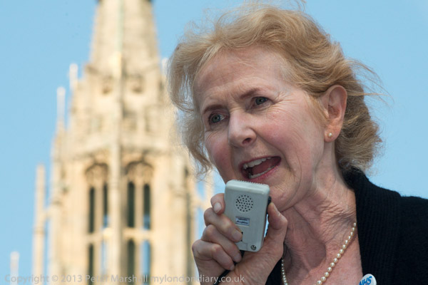
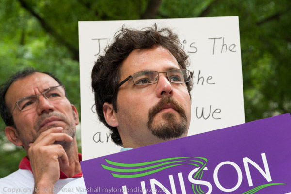
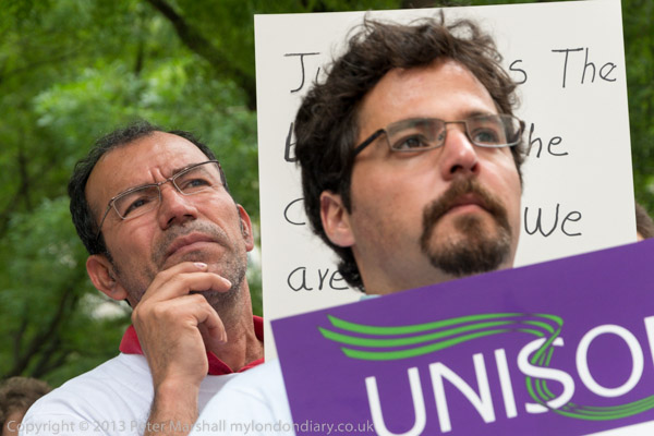
So I didn’t feel too bad about a little photographic exaggeration when I was photographing one of the speakers at the event, talking about police surveillance and harassment. Perhaps 20 yards behind her were two police standing and watching the protest, and it seemed a good idea to use a very long lens to make them seem rather closer. The picture above was taken at an equivalent focal length of 45mm – a standard lens.
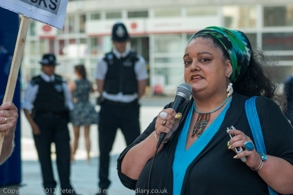
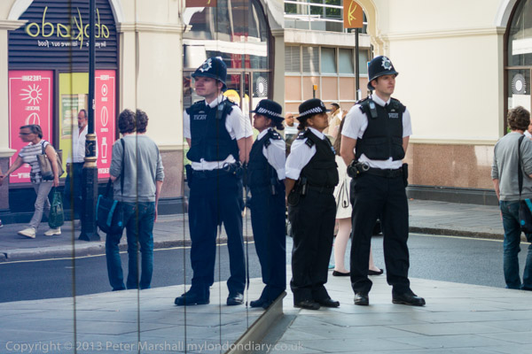
Changing to 168mm gives a rather different impression, of the officers being much closer and I’ve also used a lower viewpoint so the male officer seems to be looking down on the speaker – Zita Holbourne of BARAC (Black Activists Rising Against Cuts) and the PCS union.
It is perhaps a little unfair, as I don’t think these two officers were actually taking a great interest in what was happening – I didn’t see either making a single note – though they had obviously been posted there to keep an eye on things.
The protest was taking place in front of a wall of blue glass at Scotland Yard. I don’t think the police can see out through this, but I don’t know. It did reflect the protesters and it also had the police coat of arms at intervals, which I’ve brought out a little in the pictures, increasing the contrast a little. The blue colour is significant too – the colour of the lamp which marked all police stations.
I couldn’t resist making use of that blue glass to suggest a solution to the problem of lack of police manpower. Again I’ve used a longish focal length, and have cheated a little in the post-processing, removing much but not all of the blue from the glass in the reflection at left and adjusting the contrast and brightness to almost match. It’s just a pity that I didn’t quite get the image pin-sharp – I think the focus was a little out. I needed to take it in a hurry before they noticed me and moved.