I’m not sure that the London Borough of Hounslow’s tourist industry needs encouragement, though despite having one of the world’s busiest airports (and if our current government gets its way having managed to pass a vote on its expansion, one that will certainly be, despite all promises, busier, noisier and more polluting if an extra runway actually gets build) on its doorstep it doesn’t seem to be a major tourist attraction. Most are only too keen to get away from the LB Hounslow as fast as they can, by tube, taxi or expensive train.
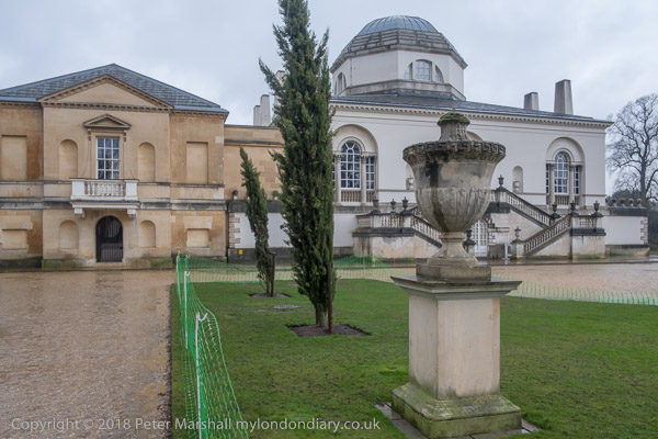
But there certainly are parts worth a visit. Some houses – Chiswick House, Syon and Osterley and areas of housing; a splendid piece of riverside, a few interesting small museums including Hogarth’s House. And quite a few parks with points of interest, the finest of which is perhaps the grounds of Chiswick House. And these gardens are free to visit, open all the year round.
I grew up a few miles away and visited the gardens here a few time when young, brought by my father, a keen gardener, who always carried a pair of scissors in his pocket to take the occasional cutting when no-one was looking, and when near home, some seeds of the decorative giant thistle echinops to scatter in any likely looking bare patch of ground because they were so good for the bees he kept.
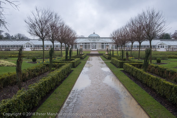
Then I think the gardens were overgrown, and the giant conservatory dilapidated, but both have now been much restores. The huge greenhouse – which people always said was built by Joseph Paxton of Chatworth and Crystal Palace fame (he was a gardener and not a footballer) but wasn’t – was really built by mistake. It was built in 1812-13 to the designs of Samuel Ware and was then the longest ever, at 2 feet over a 100 yards. The 6th Duke of Devonshire was then owner of the house and ordered it to put his camellia collection in. These plants, which grow wild in much of south-east Asia, became a great craze at the end of the 18th and early 19th centuries, selling for high prices and making fortunes for some nurseries. Some have survived from back then and are now very rare.
I suspect my father took a few cuttings as usual, and there may still today be some from here surviving in some of the gardens in Hounslow he looked after, though the better of these are now long covered with flats.
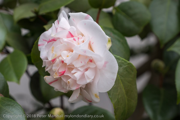
It was probably the high prices that made people want to molly-coddle them, or perhaps just ignorance. They grow in their native soils in greater extremes of weather than we see in England, and just a few days earlier I had seen one in a front garden not far from our home with its flowers covered by snow. Though conservatories like this one would have been pleasant places to sit and walk and view your collection of plants, so perhaps the roof and heating were more for the benefit of people rather than plants.
And if you are not a gardener and wouldn’t know a camellia from a chrysanthemum, you will almost certainly have some familiarity with the drink made from the dried leaves of one variety of camellia. We call it ‘tea’.
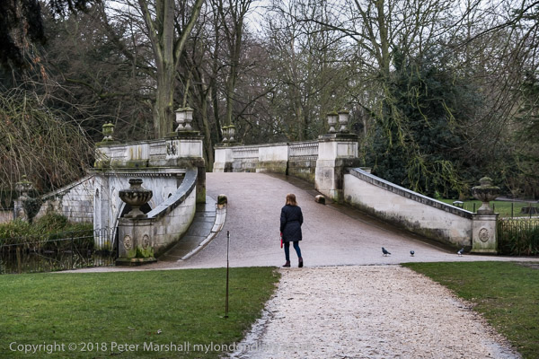
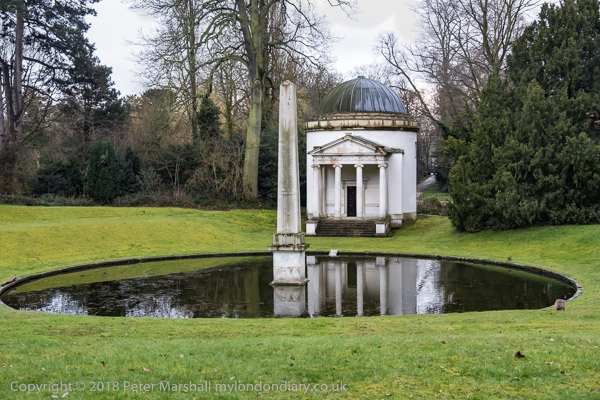
The rest of the gardens were really the start of a new movement in garden design, the first “natural” garden in what became known as the ‘English Landscape Movement’, designed by William Kent for Lord Burlington, who also had the house built to his own designed, aided by Kent and copying the work from various Italian buildings, particularly those of Palladio. The house was built in 1726-9 but work went on with gardens for some years. Although the gardens may be natural they contain many unnatural features of classical origin, the house and gardens representing Burlington’s attempt to create a Roman villa situated in a symbolic Roman garden.
Photographers will of course recognise them as they featured in several fine pictures by Bill Brandt, and of course many other photographers including Edwin Smith. I’ve made a few pictures there in the past, but make no claims for these hurried snaps taken on a dull and wet day on an outing with others who were keen to get back to the car.
Both house and gardens are worth a visit, and the gardens and conservatory have been well restored (doubtless thanks to idiots buying lottery tickets.) There is a charge of entry to the house which is run by English Heritage, but the gardens are free. There is also a newly opened restaurant in which we had lunch, but I’d recommend a riverside walk from here to one of the Hammersmith pubs for a proper meal. You could also visit (on a Thursday or Saturday aftenoon) the small William Morris Society museum on Hammersmith Mall, and if sufficiently organised to book in advance, take the fascinating guided tour of Emery Walker’s house in Hammersmith Terrace.
______________________________________________________
There are no adverts on this site and it receives no sponsorship, and I like to keep it that way. But it does take a considerable amount of my time and thought, and if you enjoy reading it, a small donation – perhaps the cost of a beer – would be appreciated.
My London Diary : London Photos : Hull : River Lea/Lee Valley : London’s Industrial Heritage
All photographs on this and my other sites, unless otherwise stated, are taken by and copyright of Peter Marshall, and are available for reproduction or can be bought as prints.
To order prints or reproduce images
________________________________________________________