Paris and London: MEP & PG

Late yesterday I got back from a week in Paris, and one of the highlights of any trip there for a photographer has to be a visit to the Maison Europeene de la Photographie (MEP) .

I’ll write in more detail about some of the things I saw there in other posts, but what really struck me – yet again – was the complete difference in outlook between the MEP and our London flagship The Photographers’ Gallery (PG).

Of course we can hope that some things may change when the PG moves to more extensive premises shortly, but the biggest difference so far as photography is concerned is one of attitude. The MEP clearly believes in photography, celebrates it and promotes it, while for many years the PG has seemed rather ashamed of it, with a programme that has seemed to be clearly aimed at attempting to legitimise it as a genuine – if rather minor – aspect of art.  (It was something that worried photographers in the nineteenth century – but most of us have got over it by now.)

One important difference between the two spaces is that at the MEP you pay to see photography – 6 euros (3 for reductions) though Wednesday is something of a photographers’ evening as entry is then free to all. (A press card gets you in free at all times.) This charge doesn’t appear to put people off, and almost every time I’ve visited over the years I’ve had to queue anything from 5 to 20 minutes to get in. But it does make it a little more of an event to go there, and it does mean that the MEP has got to offer something people feel is worth paying for.


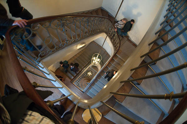
The staircase at the MEP

Of course the MEP does have a rather grand space with perhaps 3-5 times the size of the old PG, it also makes better use of it – at the PG half the space was usually largely wasted by being a coffee bar with a few pictures around the wall (and I think some other areas, such as the print room could also have been far better used.) And although I did sometimes enjoy meeting people in the cafe and having a coffee, I’d rather have been able to see a proper show and then pop across to the Porcupine or elsewhere to socialise (which of course I also did over the years.)

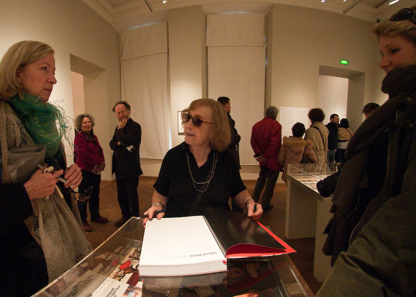
Sabine Weiss signs books in her MEP exhibition
Sabine Weiss talks to visitors and signs books at her MEP exhibition

This time, one floor of the MEP – perhaps around the total amount of exhibition space at the PG – was given over to a retrospective of the work of Sabine Weiss – which I’ll write about in another post. A Swiss-born photographer, she started her distinguished career in Paris and took arguably her best pictures there, so this was a particularly appropriate venue, although it would be nice to see this work in London too.

But one could also propose shows by a number of British photographers of similar stature who have so far been largely or entirely neglected by the PG. Not that I would want any gallery to be insular, but I feel major galleries do have a responsibility to promote work connected to their country and place, especially when like London and Paris they have played vital roles in the history of the medium.

Another floor of the MEP showed the complete photographic works of David McDermott and Peter McGough, two USAmerican artists who have made extensive use of various alternative printing processes (good salt prints, rather indifferent cyanotype and gum bichromates etc) as a part of an extensive lived re-enaction of life as late nineteenth and early twentieth century gentlemen. I don’t think they would want to be called photographers, but their work, as well as the interest of the processes concerned was witty and full of ideas, whereas some of the shows by artists at the PG seem very much one-trick ponies – including the last that filled the space adjoining the book shop.

Another, smaller space at the MEP covered the career of Turkish photographer Göksin Sipahioglu, who became ‘Monsieur SIPA, Photographe‘ after founding his agency when he came to Paris as a photographer in the 1960s.

Sipahioglu is a perhaps unfairly often thought of as a no-frills photojournalist who excelled at being there and getting pictures rather than for subtlety, but the work on show made me want to rewrite the lengthy piece I wrote about his work a few years ago.

Also showing in the MEP were a series of colour portraits  of artists in their studios by Marie-Paule Nègre, originally produced on a monthly basis for the Gazette de l’Hôtel Drouot to accompany interviews with the artists. While the theme is well worn, the images were well done and often had a freshness and interest. Which is more than I can say for Mutations II  / Moving Stills, a selection of videos made by European artists – part of the European Month of Photography – the short sequence of which I viewed had all the Warholian attraction of paint drying. However each did have its small group of apparently enthralled watchers.

Although of course curators play an important role in the exhibitions at the MEP (from a visit a year or two ago I recall an awesome show of the life of a single photograph by Kertesz) I get the feeling that photography at the MEP (and perhaps in France in general) is still very much based on the work of photographers. In the UK in the late 1970s the Arts Council made the fatal mistake of handing over the medium to curators and galleries, and we – as the PG evidences – are still suffering from it.

8 Magazine

The latest issue , No 24, Autumn 2008, of 8 Magazine that thumped through my letter box recently is another bumper one with almost 180 pages, although thankfully for the health of the magazine, a few of them are adverts.  It’s not cheap, but given its size and contents I think is reasonable value at £44 for the two issues per year (UK, including postage – see the web site for subscription details and sixty preview pages.)

It includes eight features with some fine photography; the oustanding work to my mind was Kathryn Cook‘s on the legacy of the Armenian genocide, but I also very much liked Alvaro Ybarra Zavala‘s pictures of the FARC in Colombia. Features by Murray Ballard, Ilan Godfrey, Michael Donald and Andrea Diefenbach also very much caught my eye.

Obviously I disagree with some of the opinions expressed by the writers, but that’s good too, and there are plenty of other things here to stimulate or entertain. It was good to read Chris Steele Perkins on press photographers including images by Don McPhee, Dennis Thorpe and Neal Libbert, and even more so to read his review of David Mellor‘s book and exhibition “No Such Thing as Society.”

The main problem with this book is, as he says, its sub-title “Photography in Britain, 1967-87” which it so clearly is not (and a similar criticism could be and was levelled at the great Tate “How We Are: Photographing Britain” last year, not least on this site.)

Mellor’s show and book has the same limitations as the two collections on which it was based, that of the Arts Council and the British Council, both missing out on most of what was happening in photography in the UK at the time (and probably at all times.) Steele Perkins makes clear that Mellor failed to consult people such as himself and David Hurn who were at the thick of things and the book misses out – as the collections did at the time – on a whole new flourishing of photography in this country, both in the commercial sector with colour supplements and foreign picture magazines, but also in the independent sector which emerged in this period with many photographers working without the benefit of recognition or funding from official bodies.

No Such Thing as Society” is one of a number of attempts to rewrite the history of the era – an earlier example would be the ‘Camerawork Essays‘  – see the article by Paul Trevor and myself.

Anderson on Objectivity

I was sorry to miss Christopher Anderson talking at the HOST Gallery at the start of last month but I did manage to see his show there, My America which continues until 15 November, and have to say I was a little disappointed. It combined work from the two presidential campaign trails of President George W Bush with pictures from the campaigns of both Barack Obama and John McCain to produce a view of the US political process steeped in its fakery and image creation and the excesses of a kind of patriotic sycophancy (and make-up) but it often failed to catch my interest in the way that his other work has. Perhaps it is a show you really need to be American (or particularly USAmerican)  to appreciate. For me there were just too many men in bad ties.

But it is a show that demonstrates his views on objectivity, which you can also hear him talk about in a conversation on the Magnum blog. Anderson doesn’t like to be called a photojournalist, and feels that he functions as “an editorialist rather than a reporter.” In the classic age of photojournalism, the public relied on photojournalists to inform them about what was happening around the world, but now we get the news through TV and other sources, and still photographers have a different function, “not just make a nice picture or not just report an event but in some way comment on an event or offer a perspective on it.”

Although he still feels that he tries to be as honest and as “truthful” as he can, this doesn’t mean being objective but being essentially subjective, to have a point of view and make clear what it is as well as expressing his views clearly through his images.

Of course there is nothing new in this. Many photographers have said similar things over the years.  Philip Jones Griffiths made his views absolutely clear “To me, there is no point in pressing the shutter unless you are making some caustic comment on the incongruities of life. That is what photography is all about. It is the only reason for doing it.” He mocked editors who didn’t understand when he asked how they wanted him to approach South East Asia by saying they all they could tell him was that they wanted “temple bells.” But although we may have wider and more complex views than Jones Griffiths, we all know that you have to have a point of view (physical and metaphorical) to make pictures and, more importantly, to know which of the infinite possibilities are worth making.

Anderson’s Magnum page has a slightly different message to the video: Emotion or feeling is really the only thing about pictures I find interesting. Beyond that it is just a trick.”  Look at the pictures there and click on the ‘Major features‘ link at bottom right to see how well he puts that into practice. But there were too many in the HOST show that I at least felt were just a trick.

Who needs medium format (or full frame, or APS?)

All of us (apart from a few masochists) would like a camera that was small, easy to carry and use and relatively cheap but took pictures that would (at least technically) be as good as those that you can get from big and expensive cameras (if you can afford them.) Photography has always been very much tied to expense – whether it was the manservant and the photographic van for Roger Fenton in the Crimea or the eye-watering cost of the digital Hasselblad (though they recently announced a price cut.)  And through the history of photography there have probably always been people ready to point out that a good big’un will always beat a good little one.

In You’ve Got to be Kidding! No – I’m Not, Michael Reichmann of Luminous Landscape compares a Hasselblad H2 with Phase One P45+ back and a Hasselblad 55-110mm lens is compared with the Canon G10, costing somewhere around $39,500 less.  The test conditions slightly favoured the Hassleblad as that was firmly on a tripod, whereas the G10 was simply held on top of it.

Of course the ultimate image quality of the Hassleblad combination was higher, and as the article states will clearly show for large prints – greater than 13×9 inches.  But at this size he found that photographers and industry pros couldn’t tell the difference between prints from the two cameras.  The only significant difference at this size was in the depth of field.

So is it still worth shooting on larger and more expensive cameras? Often of course it is, as the larger sensors will certainly perform better at higher ISO and for when larger prints are needed.  You also get advantages such as better viewfinders and greater flexibility at least with DLSRs – including the ability to use lenses like the 10.5mm semi-fisheye I rather like.

But cameras like the Canon G10 do show how good small-sensor cameras can be, at least where the light is good enough to use relatively low ISO and where really large prints are not needed.

Of course, camera choice ends up as a very personal thing. Reichmann in a comparative review of the Canon G10 and the Nikon P6000 (which also refers to the Panasonic LX-3) makes clear some of the differences of approach reflected in these cameras (and the Canon G9.)  Users who hoped that the G10 would be a better G9 may well be disappointed, and Dave Allen certainly was. If you’ve not seen his video review yet, don’t miss it. Even if you have no interest at all in the G10 I think you will enjoy it.

Despite this I’m still thinking about buying one!

Wacky UK?

I spent the last weekend away from home, staying at a friend’s house in the north-east, where we had gone to celebrate his 90th birthday with a surprise party – with more friends coming from London and Sheffield for the event. Despite the misgivings of one of his neighbours – “What are you trying to do, kill him?” she asked –  it went off well;  we had after all known him for at least twice as long as her.

But being away from home, and in weather so poor I didn’t feel like going out anywhere with a camera left me plenty of time to read the papers, and in the Guardian Weekend Magazine I found a feature on ‘Martin Parr‘s Britain’, with 12 pages mainly of pictures from a lengthy project by him for the paper covering 10 English cities.

Parr was a photographer I admired greatly in the 1970s, although I’ve found some of his later work not entirely to my taste. He’s made a enviable reputation for himself, as well as a not so small fortune from his photography, but does sometimes seem to be cruising on that reputation rather than producing work of any consequence.  And although there were a few pictures I admired in the feature, as a whole it left me thinking that far from  (in the Guardian’s words) capturing “the essence of Britain’s cities” what we had was a few assorted glimpses of the wacky extremes of British (mainly English) eccentricity rather than any serious attempt to tackle the ostensible subject. It did really seem to be a good example of taking the easy way out, and I thought about writing a serious blog post about the work.

Perhaps fortunately I don’t need to, because Simon Roberts has done a very good job already. Although my thoughts would differ in detail, his UNDERWHELMED BY PARR raises some of the same thoughts that I had, mainly in quotations from letters on the Guardian web site, where you can see rather more of his project than appeared in Saturday’s magazine in a slide show called Pies, parties and pink drinks. Despite the joky title, this is a considerably better edit than that which appeared in the magazine.

Roberts of course has a certain competitive interest in the subject, having this year been engaged in his project ‘We English‘, supported by the National Media Museum, Arts Council England and The John Kobal Foundation, which he describes as ” a photographic journal of life in England in 2008“. At the moment if you click on the ‘GALLERY’ link at the top of this page it leads only to a picture of him with a page of biographical information. Perhaps when this emerges as the promised book and exhibition of 36×48” landscape prints in Autumn 2009, Martin Parr can be tempted to review it.  Having so far only seen the two pictures in a Foto 8 feature I might well find Parr’s work of greater interest.

Banking on Photography

This is very much the year of China, so it came as no great surprise to see the winner of the Pix Pictet 2008 was Canadian photographer Benoit Aquin for a series of images, The Chinese ‘Dust Bowl’. The 10 images on the front page of the web site are perhaps a little too small to really judge the images, which are inkjet prints varying from 34×52 cm to 86x132cm  (13×20″ to 34×52″ for those of us who still inhabit an imperial universe.) As in the pictures of Ferit Kuyas who I wrote about earlier in the year and others, China is seen through a dim haze of pollution.

Aquin’s series of pictures would probably not have been my first choice, but certainly would have featured in my top two or three not least for taking the theme of water in the context of sustainability seriously;  it seemed at best peripheral to some other entries.

Those short-listed were Edward Burtynksky, Jesus Abad Colorado, Thomas Joshua Cooper, Sebastian Copeland, Christian Cravo, Lynn Davis, Reza Deghati, Susan Derges, Malcolm Hutcheson, Chris Jordan, Carl De Keyzer, David Maisel, Mary Mattingly, Robert Polidori, Roman Signer, Jules Spinatsch and Munem Wasif.

In another announcement made at the awards ceremony, Munem Wasif was selected for the commission to document WaterAid’s Chittagong Hill Tracts Project in Bangladesh which is supported by Pictet & Cie. If you don’t already know Wasif’s work, his web site is certainly worth a look. He would also certainly have made my top three for the prize.

The prize entries also reflected another big story, Hurricane Katrina, although by now this seems rather passée, although I suspect either of these photographers might have got the award had this been the Prix Pictet 2006, but this year is the first of these competitions. Although I think Aquin’s work was more interesting, I do wonder how this and some other current high-profile work from China will seem to us when the Beijing games are a distant memory, and wonder whether some things are better left to World Press Photo.

You can see more of the pictures entered, along with a commentary by the head of the Prix Pictet jury, Francis Hodgson (a man who thinks stroboscopic lights are  high technology!) on a few selected photographers from those shown on the BBC web site. His comments about the broadest range of photography being invited to take part, even amateurs, is perhaps disingenuous; as my previous post on the Prix Pictet notes, this is a contest that no one can enter, the 18 short-listed photographers being selected by judges from names put forward by 49 leading experts.

I had hoped to get the opportunity to see the works at a preview in London, but this was cancelled at the last minute, probably because bankers were rather busy with other matters. Unfortunately I was too busy to take up my invitation to the opening of the show in Paris last week, where Kofi Annan awarded the £50,000 prize, and the show of short-listed works at the Palais de Tokyo closes on 8 November 2008, a couple of days before I arrive in Paris.

Rt Click, View image to see larger
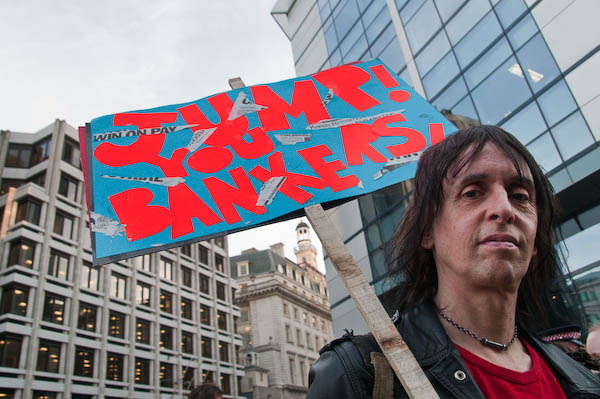
‘Jump You Bankers’

Lightroom 2.1 – some thoughts

Raw Conversion

Perhaps most importantly, the latest release of Lightroom does its prime job of conversion from RAW format pretty well. For some time I’ve been using the ‘Adobe Standard Camera Beta 1‘ camera profiles, which did seem to give a more pleasing result – and now the beta 2 profiles are available so I’m trying those. The differences between the two versions seem extremely subtle!

LR 2.1 also includes the latest Camera Raw 5.1 which is a part of the new Photoshop CS4 release, although for some reason it has a different version number in Lightroom.
There may still be a few images where I’d like a ‘second opinion’ by using Capture One or the Nikon software, but I think they will be very rare.

LR 2.1 also adds support for a few new cameras, including the Nikon D700. So that’s one reason less not to go for the full-frame model. However at the moment I’m feeling pretty satisfied by what I can get from the D300, and can’t justify the expense of a new camera – and the new lenses it would also need.

Stability

I’d hoped that the full release of LR 2.1 would be more stable than the release candidate, but it doesn’t appear to be so on my system.

LR is a great program, and the addition of a great ‘dodge’ and ‘burn’ tool in version 2 has dramatically improved some of my pictures. Before it was often too much trouble to load an image into Photoshop for a little cosmetic surgery, but mow its possible to add that correction rapidly in LR itself – so it’s far more likely to get done.

But this seems to be one area that causes LR2.x to fall down occasionally, perhaps on average after around half an hour of working. It’s not so far been a great problem; either the program exits nice and cleanly or hangs so I need to kill the process in Task Manager, then reload LR  – it takes perhaps less than a minute, and at least so far I’ve never lost more than the actual final alteration to the image I was working on.

The second area where I’ve had problems is in writing out batches of files. Normally while I’m doing this LR takes up a high % of processor time and anything from 250-750 MB of memory. But occasionally the memory goes up to well over a GB and LR fails to write some files  – and gives an error message. So far I’ve not had it fail when writing single images.

Keyboard Shortcuts for Adjustment Brush

Like me you probably didn’t bother to read the manual!

k      toggles the brush on and off
Space    hold down to use the mouse to zoom in
h    Hides and shows the adjustment pin
Delete     Over the adjustment pin deletes the whole adjustment
Ctrl-Z deletes the latest item in the history (can repeat)
   toggles the mask display (see below)

To see the mask you have created, mouse-over the adjustment pin
To erase parts of the mask, use the erase brush

I expect there are a few other useful things I’ve forgotten – which means I don’t use them.

Annoying Gaps

There are still some annoying gaps in LR. It would be nice to have the distortion correction capabilities of PTLens – and although you can add recent versions of the standalone software to the ‘Edit with‘ list in LR it is actually rather less convenient than using the plugin via Photoshop. As well as distortion, PTLens also does a decent job of converting fisheye images to rectilinear, which can occasionally be useful, although the angle of view is simply too great for a rectilinear approach to work for most images, at least without extensive cropping.

Another Photoshop plugin I use with fisheye images is Fisheye-Hemi from Image Trends Inc. This is a fairly cheap but effective way of removing some of the curvature and distortion from fisheye images, and often but not always improves the result. You lose the extreme corners of the image, but it retains the content at the centre of the sides and top of the frame.  This is now also available as a plugin for Apple Aperture, but not for Lightroom.

There are Lightroom Plugins, but most seem simply designed to add “effects” to screw up your images while giving you the entirely undeserved feeling that you are being creative (rather like “lith” printing. – in fact I’m sure there are several that give you just that, a “lith” effect, along with sepia etc.) All these effects are possible without having a plugin by using appropriate settings in the various Lightroom tools, and you could always make your own presets if you were that way inclined. But some are available for free and will be easier to use.

One of the few possibly genuinely useful filters currently listed on the Adobe Lightroom Exchange site for Lightroom Plugins is LR/Enfuse, which allows you to blend multiple exposures (which can be virtual copies of files) to cope with extremes of lighting (there is an example on author Timothy Armes‘s site. I haven’t yet felt the need to use this myself.

Again thinking of wide-angle images, it would be very useful to have the ability to correct normal wide-angle distortion in Lightroom – as you can with the ‘Free Transform, Warp’ command in recent versions of Photoshop.

Lightroom also lacks an automatic detection and removal of chromatic aberration, a feature whic is implemented fairly well in the latest Capture One software. Purple fringe removal is another area where LR lags sadly behind CO. There is a ‘Defringe’ in LR, but it seldom has a great deal of effect.

RAW Converters: Capture One Pro 4.5

When I first started shooting digital, the RAW converter favoured by many pros was Capture One (CO), and so I bought a copy, and was reasonably impressed by the quality of the output although never by the speed of operation.

When Pixmantec brought out their RAW software I was easily converted, at least when the improved Pro version appeared. The output files looked more or less as good as those from CO, but the big advantages were in speed, workflow and a more intuitive interface.

Then Adobe bought up Pixmantec, wanting to incorporate its superior technology into their own products. Many of us were disappointed, but at least Adobe did give us the promise of a free copy. Lightroom when it finally arrived took a little getting used to (and I had to buy a higher spec computer to run it) but soon had me convinced that its integrated approach covering image management was the way forward.

More recently I’ve been more than impressed by Lightroom 2.1 RC (not a Catholic conversion but “release candidate“) which Adobe brought out rapidly to redress the problems which hobbled the performance of 2.0 on my machine.) Its burn and dodge tool in particular has almost completey removed the need to transfer any of my images to Photoshop in normal processing.

Long ago I’d subscribed to several future upgrades for CO, so I’ve kept up with the various releases of this. Although I didn’t use it often, there were occasional images where I just was not satisfied with the results I could get from Lightroom, and often found I could get a visibly better result with CO.

For some time, Phase One has been heralding the appearance of Capture One 4 PRO, and finally it has arrived. I downloaded and installed it this afternoon (I find it is version 4.5) You can see more about it on the Phase One site and download a trial copy if you want to try it out.

It is a real improvement over earlier versions, with improved tuning of image colours as well as a new skin tone tool. But even in these new tools there were some disappointments. One of the program’s problems has always been that it is in part a specialised tool for photographers using Phase One’s digital camera backs. It would simplify the software if this support (and that for some other tethered cameras) was eliminated from the normal version of the software. It remains rather less intuitive than Lightroom.

The lens correction tools are very welcome, but limited, again due to the software being seen as a support for Phase One. A product intended for pro use should at least come with lens profiles for popular Nikon (and Canon) lenses allowing the easy removal of lens distortions and chromatic aberration. However the the automatic CA removal works quite well and is fairly fast, and purple fringing is also handled quite well. (Presets are supplied for a few Contax and Hassleblad lenses.)

I was unable to carry out distortion correction as there were no presets for any lens that I use. The manual suggests you can adjust distortion manually (and save the results as Style presets for a very limited approach to automatic correction) but this is generally very difficult to judge with any accuracy. There is only a single control so more complex distortion cannot be handled. Manual vignetting adjustment is also possible, but so far whatever I’ve tried the ‘Color Cast’ check box and ‘Sharpness Falloff’ and ‘Light Falloff’ sliders and check boxes are simply unavailable clutter on the interface.

The other unacceptably poorly implemented feature in CO is Metadata support. You can add IPTC caption and copyright information, but not other essential fields such as keywords, location, date, category etc.

CO is probably a decenttool for studio-based photographers who don’t work with agencies or picture libraries and where optimum image quality is a high prioriyt. In particular it will appeal to those who find its “styles” useful rather than those who prefer their photography untrampled by such “creative effects.”

If you shoot on Nikon and need software to deal with the occasional file where Lightroom 2.1 doesn’t quite come up with what you need, then probably the best overall choice is the powerful if almost terminally unfriendly Nikon Capture NX RAW software (now actually NX2.) Just don’t ask me how to use it.

IJFR – forget jpeg + RAW

Once I got a camera that would write RAW files, I made up my mind to shoot everything (or almost everything) on RAW.  Despite what one or two loud-mouthed guys on the web say, RAW does enable you to get considerably more out of your pictures – and the only real disadvantge is the extra time involved in processing.

Some cameras do have RAW+Jpeg modes which save both types of file, giving you the potential advantage of speed as well as the higher quality ofRAW – but with the disadvatnage of filling up memory cards with fewer pictures.  But what many photographers fail to realise is that RAW files actually contain a jpeg image as well as the sensor raw data. It’s this jpeg image that you see on the screen on the back of the camera, and also that is used to show the files in your RAW processing software before you process the files, and in other software that displays images direct from RAW files.

A couple of years ago I found (and wrote about) a piece of PC freeware called  Preview Extractor which I use to tell me the total number of exposures I’ve made with my Nikon cameras, but also will rapidly extract theses jpeg preview images from a batch of images.

Recently I’ve come across another free application that can also do this – and is available for both PC and Mac, and is handier to use as it adds itself in your right-click menu. You can right-click on a file or group of files and select it to extract the full size jpegs, or smaller size files. This is a virtually instant process.  Install this small utitlity and you never need to use a Jpeg + RAW mode.

So, thanks to Michael Tapes of RawWorkflow.com and the programmers at Imagenomic for the free Instant JPEG from Raw  and you can read more about it and watch a video showing it in use on Scott Kelby’s blog.

Black & White Printing Compared

Having spent rather too much time in the last couple of weeks printing from my black and white negs for the the English Carnival show I was interested to see a feature on Tyler Boley‘s ‘Custom Digital‘ blog, B&W print quality which compares some of the best currently available printing systems with conventional silver printing.

Boley’s  feature has its limitations; for one thing it looks at inkjet systems for printing on matte paper (Hahnemuhle Photorag 308g) , although it does include Epson’s ABW which will also work on gloss papers. I actually like matte prints, but their qualities are rather different from those of glossy prints (and matte inkjet prints are rather different and generally tonally superior to matte silver prints) although of course these differences are reduced by framing under glass.

Despite these, the results are really interesting, and clearly show the superiority both of prints produced using the latest rather pricey StudioPrint Rip with a dual quad ink setup and the more “off the shelf” and considerably cheaper QTR (Quad Tone Rip)  used with the Selenium K7 inkset from Jone Cone, which proves to be the ultimate currently available inkjet solution (and there is a special edition for the low-price Epson 1400.)

What is also clear is that a contact print from the silver negative still has a considerable edge over ink when examined at a micro level (on the linked page with larger examples, a 0.24 inch  wide section of the print displays at around 8.5 inches – around 35x magnification). Boley asks if these differences  matter, if we can actually see these differences viewing the actual print and his answer is: “I think you can, given certain images, and viewing conditions, and eyesight.”

Looking at my actual prints on the exhibition wall, where they are shown along with the work of two other photographers printing on silver, my own conclusions based on prints produced by the most primitive of the methods Boley compares, Epson ABW,  is that, for at least the kind of photography we do, the differences are not important. My prints stand comparison – at least in terms of print quality.  Everyone I’ve talked to has been surprised to be told they are inkjet.

Looking at Boley’s results, the most surprising difference to me is actually between the drum scan and the contact print.  As he notes, the scan has more detail but also considerably enhanced local edge-contrast, which he attributes to the highly collimated light source.

The silver print used in the comparison was a contact print, which might make sense for photographers working on 8×10 film, but perhaps not for the rest of us (I have shot only a handful of 8×10’s and none that produced a picture I would ever want to print.)  Typically I’m working with 10-15x linear enlargements from 35mm film (and scans at a slightly higher resolution than Boley used) and I suspect that this makes the difference between inkjet and silver print considerably less – even when looked at highly enlarged.

So, I’ve just taken two prints from the same negative, both 15×10″ prints (I made the inkjet to fit the same overmat) and scanned a small section of both at 4800dpi (the highest optical resolution of my flatbed.)  The prints were not made to be identical in contrast or density – but printed as I felt the negative should be printed roughly 10 years apart. The silver print was on Ilford Multigrade Fibre-Bass glossy and air-dried. The inkjet was printed using an Epson Photo R2400 using the K3 inks and Epson ABW printing on Permajet Fibre Base Gloss.

The differences between the two scans are noticeable when viewed at full size on my screen, equivalent to viewing the full print at billboard size from a couple of feet.  Viewed like this, the inkjet image is slightly dottier and less sharp, but  there is little difference in detail.

Reducing the image to a size so that the whole 32mm height of each scan will fit on the screen, here’s what I saw – remember the contrast and density differences were deliberate:


Detail: Epson ABW print (original 32mm high)


Detail: Silver print (original 32mm high)

There are small differences in detail in favour of silver, but they are relatively small (and on my screen I’m still looking at a 5x linear enlargement of the print) and not visible at actual print size.  Because I had deliberately chosen to reduce the contrast of this area of the print when making the inkjet it’s perhaps hard to decide whether there is any real difference in sharpness, but again I think there is very slight advantage to the silver print.  It’s also difficult to be sure that the slightly smoother appearance of the inkjet is also simply a matter of contrast.

It would have been better to choose an example where I had produced a print that more closely resembled the silver print, but those are mainly up on the gallery wall. But the real point of these two scans is not the minor differences but the close similarity. Without the contrast differences I would have been hard put to decide which was from the silver and which the inkjet print. Viewed at normal size, holding the prints in my hand there are no real quality differences, and I’m not sure which I prefer.

Boley’s is a considerably more careful study than my brief couple of scans, and clearly shows the superiority of the Cone K7 method over the Epson ABW (which seems to be gaining acceptance as some kind of fine-art inkjet standard.) If you want the highest possible quality matte black and white prints, K7 (K6 on six ink printers)  is the current ‘state of the art.’  Cone inks for use on glossy papers are promised but not yet available. Epson ABW may not reach quite the same standard in several respects but produces excellent results and can give great prints on glossy papers as well.