England’s Bumpy Bits & Marmite

Hearing on the news a few days ago that Oxford researchers have suggested that high doses of vitamin B may help prevent memory loss, I immediately reached for the Marmite, which is certainly high in B12 and folic acid, though no one seems quite able to remember whether it has much B6. Perhaps a downside is the presence in it of glutamic acid, an excitotoxin, possibly implicated in various neuro-degenerative diseases, and you would also have to eat a jar or two a day to reach the B12 dosage levels of the Oxford trials.

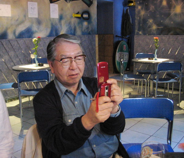
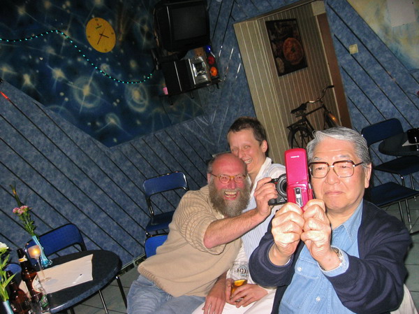
But it reminded me of our week in Cumbria last month. Not that Marmite actually appears in the pictures on the web but Bob, who at 80 still very much has all his marbles was there and eating it every day on his breakfast toast.

Personally I don’t go for toast, certainly not at home where we eat good bread. Toasting is really a way to make cheap and stale bread palatable, and to inflict it on Linda’s fresh home-made wholemeal seems sacrilege. But Marmite has its place in my photography, or at least in my camera bag, in the sandwiches that I always like to take if I’m going out from home and would otherwise miss a meal. Being on a strictish diet (low fat, low sugar etc) makes buying food out a problem, and I need regular meals to keep blood sugar at reasonable levels.

So I can recommend curd cheese, Marmite and raw onion (thinly sliced) as a cheap and tasty filling for wholemeal bread sandwiches, although it’s a shame that Marmite – even in jars – seems to be runnier than it used to be. If you want to be sure about the B6, perhaps you should eat it with peanut butter, though I don’t fancy the mix and peanuts are too full of fat for me.

© 2010, Peter Marshall
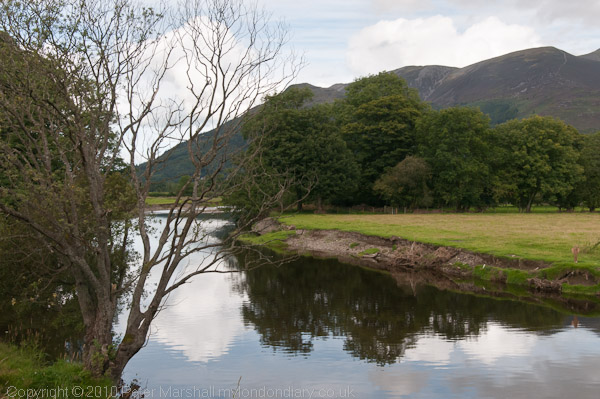
River Derwent at Keswick

The last set of pictures from Cumbria I’ve put on the web were taken on a walk to Keswick from a few miles north where we’d gone with the others on the holiday – including Bob – who as keen bird watchers they were going to spend a few hours not seeing the ospreys. We did stop for a minute at one of the viewing points but certainly weren’t going to wait for birds who couldn’t be bothered to turn up on time.

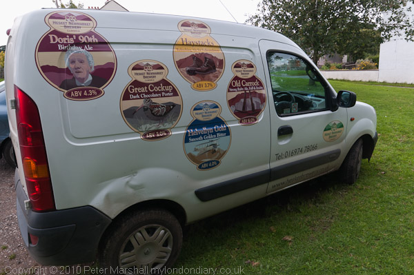
Most of the walk was pretty level, roughly following the River Derwent upstream, but the hills were all around us. I took a few pictures and they are on My London Diary (along with other sets under the label ‘Cumbrian Interlude’ covering the  Cumbrian Coast, around Wigton, and  Caldbeck and Hesket Newmarket, the home of Doris’s 90th Birthday Ale.)

Talking to a woman at the Horse Hospital on Friday we found we had a common view of the country. Her former partner had liked going for country walks and she hadn’t, clear grounds for separation. The real problem, as I said, is that “it’s all green.” Never my favourite colour.

© 2010, Peter Marshall
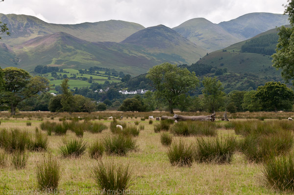
Hills to the north-west of Keswick

It’s not really a good idea to walk to Keswick. Because you end up in Keswick. A tourist trap, though the churchyard was empty and pleasant enough and the Luchinis ice cream can be recommended, the only really good thing about the town seemed to be the view away from it. It’s a town you could walk away from with a happier heart.

© 2010, Peter Marshall
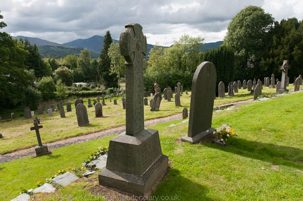
Novelist Hugh Walpole’s monument in Keswick Churchyard.

All pictures with the D300 and Nikon 18-105 VR (27-157 eq), a decent single lens to take on holiday that covers almost everything. Incredibly cheap for a Nikon lens at around £200, it’s considerably better built (though not pro standard), optically superior, lighter and shorter than the 18-200mm which costs almost 3 times as much. There is a detailed review of it at Photozone (avoid the opinionated muppet elsewhere) which comments on it’s very high resolution figures and also the rather pronounced distortion and chromatic aberration.

This is presumably a deliberate design decision, as both distortion and CA (along with the inevitable vignetting) are readily removed by software – automatically when I import the files into Lightroom 3, though I haven’t yet got a profile for this specific lens and am using one that isn’t quite a perfect match. Overall I think this is probably the best value for money ever from a Nikon lens.

Brian Griffin at NPG

© 2010, Peter Marshall

Last Friday evening Brian Griffin gave a talk on his photographs on display at the London NPG as a part of their London 2012 project until 26 September 2010 as a part of the late night opening there. I’d arrived over an hour earlier, having walked across from the Royal Festival Hall where I’d been meeting someone earlier who was on her way to an earlier start at the Royal Opera House, and thought I’d spend some time looking at the NPG collection and some of the other special activities on offer for the NPG’s ‘Late Shift‘.

I started by sitting for a portrait booth from ‘Take Away Art’ with Artist Joceline Howe hidden inside.  I have to say I found the two minute sketch of me disappointing, and the figure could have been anyone in a silly hat and a fancy frame, though I did rather like the portrait of the young lady who sat before me, but then she was considerably more attractive anyway.

I also took the opportunity to look at the exhibited work from this year’s BP Portrait Award, and have to say I found that disappointing too. There seems to be a current vogue for producing painted portraits that have a photographic look to them, and most of them I would have found rather disappointing as photographs. There were some other portraits I found more interesting but none of them were among the winners.

Also rather disappointing was the display ‘Twentieth Century Portraits‘, photographs taken by Dmitri Kasterine, that was due to open the following day but was actually in place for the Late Shift. Kasterine (b1932, England) whose father was a White Russian and mother English, began taking portraits in the early 1960s for Queen and other leading magazines, and the works on display include many well-known figures from the arts. A few of the pictures are rightly celebrated, the icons by which we remember, for example, Francis Bacon, but in the main I found most a little ordinary.

I think there is some more interesting work on his web site, and a family group I rather like on his blog posted last month that shows he is still busy.

Walking around the gallery it struck me that many of the more interesting pictures on display are not actually portraits – and that quite a few of the portraits are actually rather tedious, including much of the modern work. This came home to me particularly in a gallery entitled Expansion and Empire, where one of the more fascinating works shows Queen Victoria presenting a bible to an African guest, and another Florence Nightingale receiving the wounded at Scutari. (There is also another large image of the Queen visiting the wounded and also a picture of the relief of Lucknow.)  There are other portraits of Nightingale, the best of them certainly one of the small photographs on display but not shown on the web page. But it is the larger group images that dominate the room, and not just because of their size.

In a way I think Brian Griffin’s work for the Road to 2012 is a twenty-first century equivalent of these paintings of historical scenes, though of course he has not tried to portray actual scenes (though nor really do those historical examples.) But his work certainly does have something of their sense of theatre, although I don’t think Jerry Barrett or Thomas Jones Barker would have understood or sympathised with Anna Raybon‘s statement that the ‘Road to 2012‘ “was to be art, not PR“; clearly for them, even if the term was then unknown, PR and Art  coincided.

His talk was fairly well attended although there was plenty of room for more. Introduced by Raybon, the NPG’s Commissions Manager, the event started with a showing of the film clip of the live performance by Griffin and musician Steve Nieve on the Late show in 1988, which you can also watch on YouTube. Entitled ‘The Big Tie‘, it shows Griffin’s work on Broadgate, with a very young looking Griffin both talking and singing.

Friday he didn’t sing, but engaged in a conversation with Braybon about project and the making of some of the pictures. At one point Griffin demonstrated how he posed models “like puppets“, pushing and pulling their limbs into the positions he wanted, engaging them as actors in producing the scene he wanted. But he and Raybon stressed, the scenes only really came to life when one of the sitters added something of their own, such as when a young boxer leaned out of the tight sculptural group of four figures and raised his gloves to the camera.

Like most of his pictures, this image of the ‘young ambassadors’ from an East Ham school who had played a large part in swinging the decision to London was based on a painting, Griffin had an image of it in his mind but only actually identified it several months later on one of his frequent visits to the National Gallery.

Some of the sitters also had their own games to play. Griffin had wanted to photograph then minister Tessa  Jowell kneeling on the office carpet and draping herself onto a chair. But she came in and told him she wasn’t getting on her knees for anyone and he had to rethink. Is it just me that sees the picture that resulted with her arms out on a chair back as her with a Zimmer Frame?

© 2010, Peter Marshall

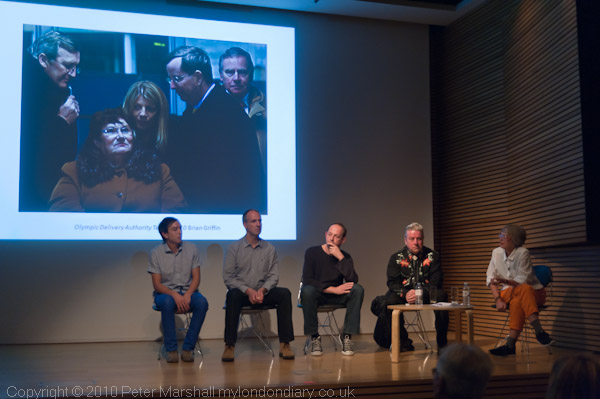
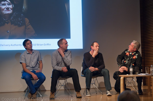
Griffin also stressed the teamwork involved in making these portraits, working with Braybon and others including his assistants on location – usually with two hours to make a picture. Towards the end of the performance he brought four of that team up onto the stage to answer questions – something that certainly came as a surprise to his printer, Mike Crawford.

© 2010, Peter Marshall

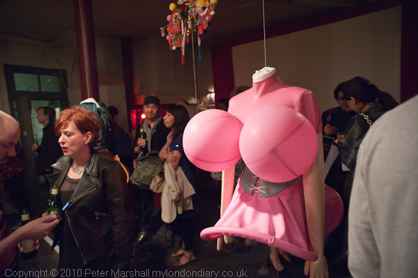
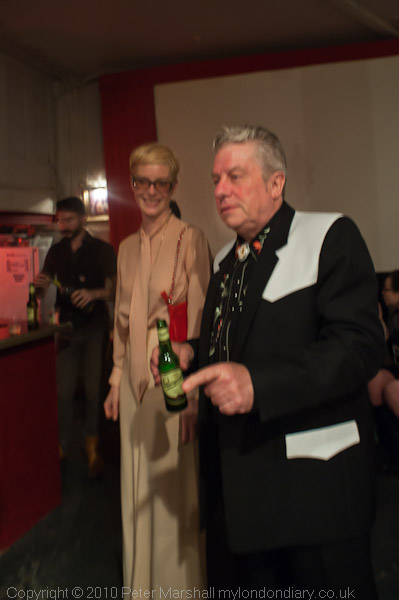
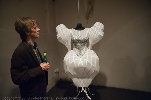
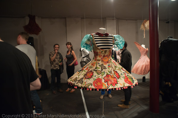
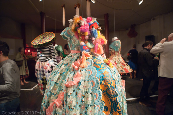
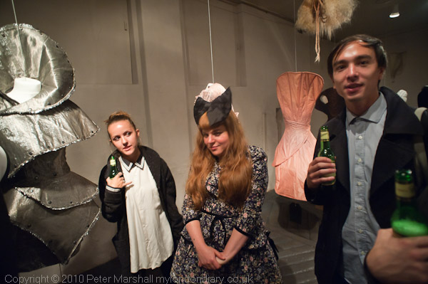
After the talk I went with Griffin and half a dozen of his friends to a show in the basement of the Horse Hospital in Bloomsbury, ‘Fake Food & Fast Cars: The Pop Couture of Kate Forbes‘, an incredible display of the “highly conceptual costumes” created by this film designer. It continues until 2 October 2010, and is certainly worth a visit.  I asked her if I might take some pictures, but failed to persuade her to move out of deep shadow in the dimly lit gallery.

© 2010, Peter Marshall
1/5s handheld and not quite sharp – Kate Forbes & Brian Griffin

© 2010, Peter Marshall

© 2010, Peter Marshall

© 2010, Peter Marshall

© 2010, Peter Marshall

Griffin, born in Birmingham in 1948, grew up in Lye,  between Halesowen and Stourbridge in Dudley and his show at the Collège des Bernardins in Paris from November 19 2010 to January 23 2011, ‘the Black Country’ is based on his memories of growing up there, with portraits based on people he knew as a child, including his family.

A couple of weeks ago he went back there to photograph some of the places that played an important part in his growing up including Ma Pardoes (The Old Swan pub) in Netherton, Netherton butchers, The Black Country Living Museum and Solid Swivel Engineering. After showing in Paris the pictures will go on display in Dudley in 2012.

Kate Forbes worked with Griffin on this project to ensure that the costumes reflected the period and location of his youth. The single picture from it on the web page, My Mother, 2010 shows a woman representing Griffin’s mother when he was a child, with hands soaked in some kind of black oily substance, in a factory overall.

Doris’s 90th Birthday Ale

I don’t usually write about beer, but Doris’s 90th Birthday Ale is no ordinary tipple, and the Hesket Newmarket Brewery is probably one of the few things I find myself on the same side as unbonny Prince Charlie.

© 2010, Peter Marshall

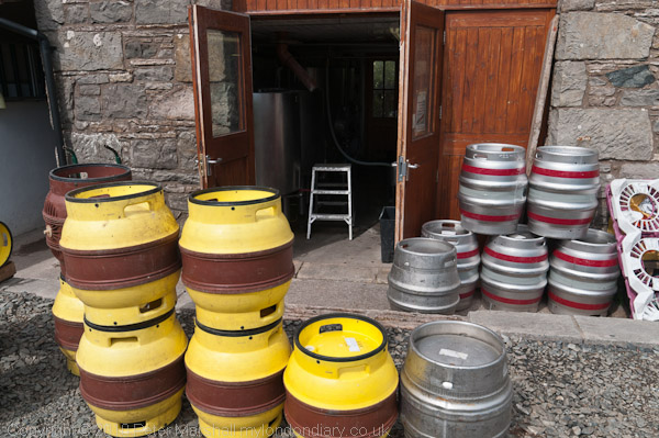
The brewery is an old barn at the back of a pub – the pub – in Hesket Newmarket, a small Cumbrian village about 15 miles south of Carlisle on the northern edge of the English Lake District. One thing that makes the Old Crown remarkable is that it is thought to be Britain’s first co-operatively owned pub, bought by a group of locals in 2003 when it would otherwise had closed. The cooperative had already bought the brewery in 1999 when Jim and Liz Fearnley decided to retire. They has set up the brewery in 1988 when they were running the Old Crown, and it became so successful that they had sold the pub in 1995 to concentrate on brewing.

© 2010, Peter Marshall

Doris was brewed in 1989 as their first expermental full malt beer, at the time of Jim’s mother-in-law’s 90th birthday, and he jokingly referred to it as ‘Doris’s 90th Birthday Ale’, although he had intended to name it (like most of the other brewery beers) after one of the local fells, Skiddaw. The name stuck and Doris became famous around the world among real ale drinkers. It was the beer that Prince Charles drank when he visited the village as patron of ‘The Pub is The Hub’ campaign. You can see more about the pub, the beers and the brewery on a video on the pub web site.

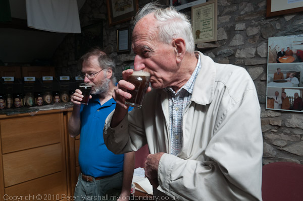
Unfortunately the pub doesn’t open at lunchtimes Monday to Thursday, so I was unable to try the pub food with a pint or two and had to make do with tea and a bacon roll at the nearby post office/shop/cafe, which was nice enough. But we did visit the brewery, and were treated to a glass of one of the ales, and could buy bottled beers.

© 2010, Peter Marshall

Travelling as I do mainly on foot and by public transport it’s hard to carry a great deal. Fortunately I’d left my Nikon 16-35mm at home, and its space in my camera bag was around the right size for a bottle of Doris’s 90th. Just a shame I couldn’t also accomodate the other half dozen brews on offer.

After arriving home, I had to let the bottle stand for a few days for the yeast to settle before carefully decanting Doris into a pint glass. It’s a clear orangey-brown liquid with a slight sparkle and a beer I could happily drink and drink…  If I lived in Cumbria I could see myself having it rather often with a meal in place of wine. The brewery web site describes it as ABV c4.3% and a “full flavoured, fruity premium beer with hints of butterscotch, carefully balanced with bitterness from Fuggles, First Gold and Herzbrucker Haler hops.”

Although these beers are avaiable at a number of pubs across Cumbria, most of the pubs I visited or went past were Jennings houses, and Jennings Bitter, the original beer from their Cockermouth brewery is a very decent pint which won the CAMRA Award for the Champion Beer of the North West 2009.

© Peter Marshall 1979
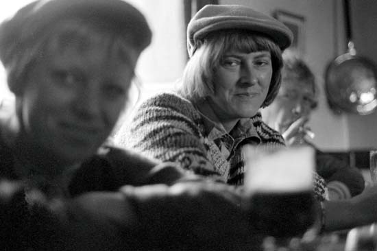
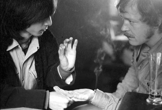
Photographers in the dimly lit pub at Brassington

Jennings is now one of five traditional breweries in Marston’s Beer Company, and for me makes another rather tenous connection with photography. Although the series of photography workshops I attended in the 1970s were based at Paul Hill’s ‘Photographer’s Place’ in a converted barn at Bradbourne, their real centre of gravity was  a mile or two away at ‘The Gate’ in Brassington, where, as well as discovering much about photography I also came across for the first time, Marston’s Pedigree.

© 1979, Peter Marshall

More pictures from The Photographers Place and also some from Hesket Newmarket and the nearby village of Caldbeck, where you can see the gravestone of the famous huntsman John Peel on My London Diary.

Jpegs From Lightroom

Two weeks ago, in the post Lightroom 3.2 RC I wrote “they haven’t tackled any of those things I find most annoying – like ‘Export’ giving lousy soft and over-large file size small jpegs.”

I met bahi a couple of months back at one of the monthly London meetings of Photo-Forum – well worth attending if you are in London on the 2nd Thursday of the month – it takes place in Jacobs Pro Lounge in the basement of their New Oxford St shop, from 6-8pm and afterwards we enjoy free food at a nearby pub paid for by a raffle during the meeting – the prizes are usually prints donated by the photographers who present work that evening.

Bahi is from Shoot Raw, an organisation that delivers support and training for photographers in digital photography, including Lightroom training and in a comment to that earlier piece  gives a useful link to Jeffrey Friedl’s analysis of file size vs quality for Lightroom JPEG export, and also asks me to go into more detail about the problem I mention.

When I read his comment I’d just been going through some of the pictures I took at Notting Hill yesterday and so decided to use the picture I’d just developed in Lightroom 3.2RC(on PC) as a fairly random example.

This is the full image – scaled down from the original D700 raw file taken at ISO 800 from 42656×2832 px to 600×399 px (and displayed here at 450x299px.)

© 2010, Peter Marshall

Not one of my greatest images!

First I tried using File Export to produce this file – here are the settings I used :

At 70% quality the file size for the 600-399px was 312kB.
At 30% quality the file size for the 600-399px was 254kB.

I tried to get File Export to produce a file using a file size limit of 150 and200Kb, but both times it reported it was unable to do so.

I selected the file and went to the web module in Lightroom, outputting a web site containing this file. I used the same 70% quality setting as before. The file produced was 118kB.

Here are some 300% details from the three Lightroom jpegs – as you can see, despite the huge file size differences the two 70% files are very similar.

© 2010, Peter Marshall
300% view of detail: File Export, Quality 30, 254 kB file

© 2010, Peter Marshall
300% view of detail: File Export, Quality 70, 312 kB file

© 2010, Peter Marshall
300% view of detail: Web Output, Quality 70, 118 kB file

[These files were created by viewing the files at 300% in ACDSee Pro, capturing with PrintScreen and pasting into Photoshop and cropping.]

70% is the setting I currently use for My London Diary, generally giving file sizes that are reasonable for broadband users – even on a page with a dozen pictures. Back in the old days of slow dial-up I used greater compression (and some special software that could actually use different compression levels on different areas of the same image) to trim file sizes to the bone, but this is no longer needed.  Before switching to Lightroom I had moved on to batch processing from full-size images with ACDSee Pro, which typically seemed to produce comparable quality with file sizes a little  smaller than Lightroom.  It isn’t possible to simply select an equivalent quality setting, but files slightly under 100kB from ACDSee seemed comparable to the Lightroom 70% file.

I’ve not investigated this Lightroom problem in great detail, butI get the impression it gives the largest files from those images I’ve worked on most with the tools such as the adjustment brush.

Friedl in his piece at the link given above points out that despite having quality settings labelled 0-100 actually only implements 13 quality levels  – just like Photoshop. I think you also get those same 13 quality levels if you use the checkbox to limit file size, but the file sizes can be different. Using quality 92 (or rather 85-92) on the above image gave a file size of 3748 kB, while limiting the file size to 5000 kB produced a visually identical file of 3550 kB.

Long, long ago when I produced jpegs using a DOS command line program I there were at least two parameters which had to be specified. One was a 1-100 setting for the quality of the match required between cells which would be replaced by the same cell, and the second was some kind of smoothing function. I don’t know that we need that kind of control, but perhaps we could be offered a little more than we have at present.

Swan Up

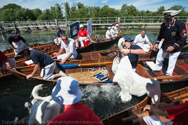
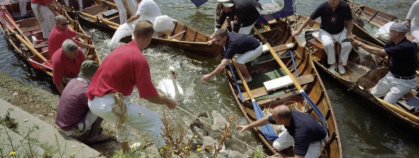
I was in two minds over whether to go and photograph the Swan Uppers again this year. It’s a subject where I think I’ve probably more or less done all I can do over the last ten years, and which in some respects doesn’t change a great deal year to year. But it was a nice day and the river is only a five minute walk away, so I went along again – as you can see below and in many more pictures on My London Diary.

© 2010, Peter Marshall
Swan upping 2010 – Nikon D700

© 2004 Peter Marshall.
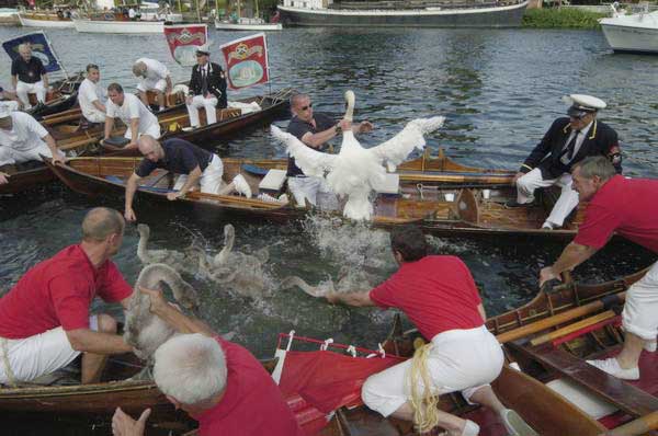
Swan upping 2004 – taken on a Nikon D100

Photographically it’s very hard not to repeat – with small variations – what I’ve done before. And since I think I’ve had some good luck in the past those variations generally result in pictures that are not quite as good as some I’ve taken before – as you can see above.

It’s also an event which is getting just a little harder to photograph, not because of any real changes in the event but simply because interest in the event, and in particular press interest has increased.  I think the first year I photographed it there were probably only around three or four other photographers present. Now it becomes virtually impossible to move at the times when you really need to be in exactly the right spot, and it isn’t quite predictable where the peak of the action will occur.

A couple of years ago there was some extra interest as it seemed likely that the Labour government would be tidying up some  of our ancient laws and this might remove the rationale behind the upping – basically an annual census of swans born each year on the non-tidal River Thames between Sunbury and Abingdon, in which the year’s cygnets are shared between the sovereign and two City of London livery companies, the Dyers and the Vintners.

In the old days swans were a feature of royal banquets – and also until around 25 years ago those of the two companies (and by a special royal dispensation, at St John’s College Cambridge); it was a privilege rigorously protected against more plebeian tastes and catching one of these royal birds could get you sent to the Tower or transported; now you only risk a fine of up to £5000 and/or six months in jail under the Wildlife and Countryside Act, 1981. I’m told that properly cooked they can be delicious, though others are less keen (and the description that they are like a ‘fishy goose’ certainly doesn’t attract me.) Certainly it doesn’t seem worth the risk.

Perhaps the best coverage I’ve made of the event was on film, using a Leica M fitting Konica Hexar RF and the Hassleblad Xpan panoramic camera (made by Fuji) , which produces a 58x24mm negative on 35mm film.  Although it was a camera I lusted after when it came out, I soon found using it with the normal 40mm lens a little disappointing.

With the 40mm you get roughly the same horizontal coverage as with a 28mm on the standard 35mm format, but of course a greatly reduced vertical coverage.  You could get the same picture simply by cropping a 28mm image, although the area of the negative would then be  less than 4/10 that of the XPan. To get the same quality you would need to shoot on 6×6 and crop, so the XPan did give you the advantage of using medium format but with handling (and choice of films and costs) of 35mm.

© 2001, Peter Marshall
Swan Upping 2001 – Hasselblad XPan and 40mm lens

But what really transformed this camera for me was the 30mm lens, equivalent to around a 20mm across the image. It comes with its own accessory viewfinder giving a beautifully large and bright view- and with a visible spirit level – and needs a special filter to combat the vignetting which is inevitable with ultra-wide rectilinear lenses. It was wider than anything available for medium format and a superb quality lens that could normally be left wide-open.

It would I think be too expensive to produce a digital version of the Xpan, and the film version is only available second-hand,  production having to be abandoned because of environmental legislation that banned the method used to make its circuit boards. The camera sold better in the UK than in other countries, but sales were not high enough to justify redesigning board to get round this.

At least one reviewer has stated that with the 30mm lens it is essential to use the camera on a tripod. I don’t think I ever tried that, but it certainly wasn’t a lens for low light work, with the maximum aperture of  f5.6 reduced by a stop and a half by the filter. But in good light it was easy enough to use hand-held, and given the focal length and aperture you seldom needed to use the normal range-finder window to focus. The automatic exposure was generally pretty accurate and in good light it was really a point and shoot camera, but as the auto-wind had to cope with almost twice the normal movement it was just a little slow to wind on for rapid action – so then I switched to the Hexar RF (the first modern ‘Leica’) which gave 2.5 fps.
BJP Looks Up

Its the time of the month for a new issue of BJP, and having sat down to read the August issue with my lunch a few days ago, for the first time I was really quite impressed by it as a monthly magazine. While some previous issues have been dealt with and discarded before I reached the cake stage, not only was I still reading this, but there were several features that I’d skimmed briefly and then thought I must read later.

I won’t bother you with the details, as they are on the BJP web site, or rather will be when they’ve got around to updating it for the current issue. One of the many things that caught my interest was a report by the editor on the festivals at Arles and Madrid, the latter of which looked considerably more interesting. His comments on Arles did solve the problem of why I’d found the festival (though I only visited it on line) so uninspiring – and frankly the first hand reports and others that I read made me glad I hadn’t made the effort to get there. It does seem to have become more and more a networking thing rather than showing new photography of any interest.

Simon Bainbridge reveals something of the art-word connections that gave this year’s festival its ‘conceptual’ bias – almost always a bad thing in photography – and unfortunately seems likely to prevent it ever being a real photography event in the future (although he puts a very different spin on it, rating this year as the best since Martin Parr’s in 2004.)

I always find it hard to understand why vacuous images around a trivial and so soon digested conceptual core are put on a pedestal and admired as great art, while truly conceptual photography – and Walker Evans exemplifies this for me – is somehow regarded as old hat and dismissed.  Perhaps because the art world has still not managed to understand photography?

The magazine still badly needs a redesign, particularly the cover, which really doesn’t make the most of Lee Friedlander‘s image from ‘America By Car’ (yet another of the features I said I wasn’t going to tell you about) and there is a slightly more proper review of the Hassleblad H4D than I wrote a few days ago (and a perhaps rather less informative piece than I’ve written though not yet posted on Lightroom 3, though some bits from it have leaked out in other posts.)

This is certainly the first issue since the BJP has gone monthly which has made me at least think that I might renew my subscription once it runs out.  Though I think it still hasn’t quite found a position in the market, and I’m still not convinced there is a place for it in print. One thing that I really miss is the old exhibitions listing, they now only seem to have the bigger shows that every other listings site will also have.

But perhaps like so many things now (including perhaps this blog) what the BJP really needs, rather than trying to sell a print magazine,  is some kind of micro-financing model for viewing web pages which would make a good web-only presence possible.  While few of us are willing to cough up the kind of subscription now needed to view newspapers such as The Times on line, some minute fractional payment to view web pages, financed by a levy on our contributions to ISPs,  rather along the line of DACS payment for photocopying of copyright materials might provide a viable source of income that would guarantee the future of diverse and useful content on the web. If every time someone read this and my other web pages I received just 0.5p it would actually make me enough to live on.

One way I might consider trying to get income is a donate button, allowing people to make the occasional contribution to me via PayPal. I’m still thinking about it.

Road to 2012 at NPG

The latest stage of the National Portrait Gallery/BT Road to 2012 project is on show (admission free) in the Studio gallery of the London National Portrait Gallery from now until 26 September 2010. It consists of a larger set of pictures from the project than previously shown by Brian Griffin along with some individual portraits of athletes by Bettina von Zwehl.

© 2010, Peter Marshall
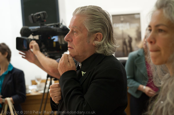
Brian Griffin listens to the speeches at the NPG

I think you can see all the pictures, along with much other material about how they were made on the NPG project web site although it seems to me to have an unnecessarily confusing interface to navigate. Of course seeing the pictures in  reproduction on the web (click on them to see them larger) is no substitute for seeing the actual work.

© 2010, Peter Marshall
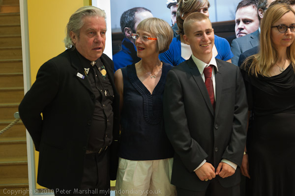
At the NPG non-Breakfast event

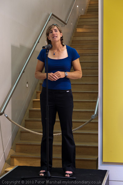
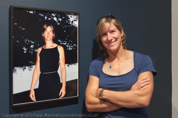
I went to the so-called “Breakfast Launch” of the show (an entirely breakfast-free event) where one of the athletes pictures, rower Katherine Grainger talked about being photographed by von Zwehl.

© 2010, Peter Marshall
Katherine Grainger

Later I was able to photograph her standing beside the portrait of her (all photographs in this review are © Peter Marshall 2010, but included works by the photographers in the show in them are © Bettina von Zwehl – National Portrait Gallery/BT Road to 2012 Project or © Brian Griffin – National Portrait Gallery/BT Road to 2012 Project respectively.)

© 2010, Peter Marshall
Katherine Grainger and her portrait by Bettina von Zwehl

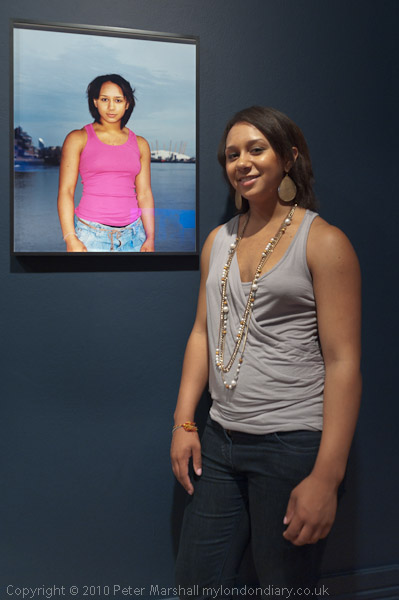
It and the similar pairing of young weightlifter Zoe Smith I think typify the problem I have with her portraits.

© 2010, Peter Marshall
Zoe Smith and her portrait by Bettina von Zwehl

Somehow to me these portraits all look too much the same. And unfortunately they don’t seem to much resemble the real people who were used to make them. It’s a particular look which I think best suits sullen adolescents but none of those in the show fits that bill. They seem to be images that tell me more about the photographer than the sitter, which isn’t what I want from a portrait.

© 2010, Peter Marshall
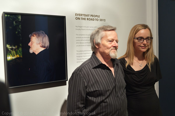
Roy Haggan won the Everyday People competition – his prize a portrait by Bettina von Zwehl – perhaps the most recognisable of those on show

As you can see, these pictures are surprisingly small – only moderately sized – and at this scale fail to demonstrate the kind of quality that the 8×10 camera can give. I’m not usually a fan of printing stuff large, but I do think these needed a greater scale, although I don’t think I would have found them any more convincing. One aspect of the larger format is that the subject stands out more from the background with the greater inherent depth of field, but here, combined with the over-lighting of the subject it often creates a kind of cardboard cut-out effect. Looking at a number of these I felt they would almost certainly have been improved by using only ambient light.

I know that von Zwehl is a very successful photographer and have admired some of her previous work, but I just don’t get these images. The gallery notes on the show describe them as “meditative observations of face, mood and physique” but I fail to find this in them. Doubtless it’s my loss.

© 2010, Peter Marshall
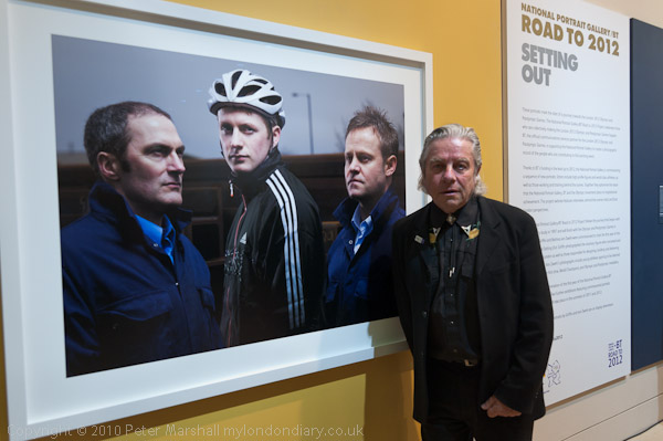
Brian Griffin with his portrait of the Kenny Family including track cyclist Jason Kenny

I have long been a fan of Brian Griffin, and as well as producing interesting work he is always an interesting guy to talk to. These works show that he has lost nothing of his touch and the show includes several that can rank among his best over the years.

© 2010, Peter Marshall
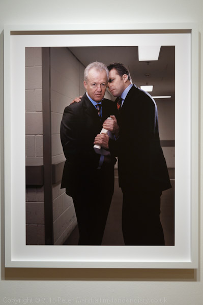
‘The conspirators’ – Simon Clegg and David Luckes

My favourite of the new works is one which I immediately christened “the conspirators“, perhaps a scene out of Hamlet, where David Luckes‘s right eye peers out over the shoulder of Simon Clegg. Both of them have a hand on the 395 page report written by Luckes in 2000 which persuaded the Mayor of London and the government to back the bid, and its white plastic spine is surely the murder weapon. Something very nasty is certainly about to happen! As we’ve now found out.

I’ve also included this image to show the framing of these works with a white border and a white frame, which I think as very effective.

There are others that struck me powerfully too. Ken Livingstone, posing with LDA Managing consultant Tony Winterbottom shows Ken pointing and Griffin makes powerful use of the frame with one finger pointing to his left exactly at its edge, and the other hand on the opposite edge above the open palm of Winterbottom, doubtless waiting for the cash to drop into it. Ken is of course wearing a red tie, the only touch of colour in the scene, taken in front of a dynamically sloping background at City Hall, reinforcing the dynamic thrust of Ken towards the frame edge.

© 2010, Peter Marshall
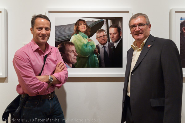
The Aquatic Team -Jim Heverin, Zaha Hadid, Stuart Fraser and Mike King

Many of those in Griffin’s pictures are men in grey suits (and some women too) but one dramatic piece of colour is provided by architect Zaha Hadid in a group showing the Aquatics centre team. Like many of his works this also illustrates his very theatrical use of lighting (and also some superb printing of his work.)

There are just one or two which I don’t think work, some where perhaps he seems to almost be parodying his own work, and others that just don’t quite come off. But overall he is creating a powerful set of work. It may well be the best thing to come out of the Olympics.

[My own ‘Olympic’ contribution is the book of pictures ‘Before the Olympics: The Lea Valley 1981-2010.’]

Nikon 16-35mm & Lens Hood Lunacy

If there is one thing that is ever likely to alter my allegiance to Nikon and switch to some other make of camera (and I don’t think it is likely to be Canon, though I’ve nothing against them, but there is just no real advantage) it will be lens hoods.

The 16-35mm f4 Nikon is a fine lens in many respects, and once I find the time to make a profile for it to use with Lightroom (or someone else kindly supplies one) I’ll be happy using it for almost anything. Even at f4 it seems pretty sharp right to the corners across more or less the full range (perhaps just a little less than biting at the 16mm end.)

For many of the pictures I take or people and events the slightly obvious distortion at 16mm doesn’t even show and can actually be a slight improvement, as more often the little bit of vignetting can also be. If it wasn’t there I’d probably want to add it in some images. And the chromatic aberration generally isn’t too noticeable in moderate sized prints either, though I’d like to remove most of it as a matter of course. I’ve seen little or none of the more troublesome blue fringing that besets some lenses, probably on account of the slightly awesome length of this wide-angle. It does get rather confusing when I’ve two cameras hanging around my neck, one with the 16-35mm and the other with a 55-200mm and I have to keep telling myself that the one with the considerably shorter lens is the telephoto.

Doubtless the size and weight of the lens are linked to its optical performance as well as to the presence of the vibration reduction. I’ve yet to detect any real advantage of this when I’ve had it switched on, and I suspect it is actually a problem in fast-moving situations, where I’ve found some frames with an inexplicable lack of sharpness that I can only blame on it.

It’s fast to focus, and I think precise in doing so. It feels pretty well built and although we haven’t really had the weather to test it I suspect will cope with the elements better than my other lenses.

The only real problem I have with it is the lens hood. Of course you don’t expect it to be too effective for a zoom of this type and to some extent it is as always just a convenient rest for your hand which will do the real job of shielding the front element from direct sun without obscuring too much of the picture (since you don’t quite see the frame edge in the viewfinder you may have to crop slightly.) And its main function is of course to cut down the chance of those straying fingers marking the front element, which it does reasonably well.

But almost every day I use this lens I find at some point, sometimes several times that I’m having to reach down to the ground to pick the wretchedly flimsy and poorly fixed plastic ring up. Yesterday I was lucky to be able to retrieve it in once pieces as on one of the three occasions it came off it rolled onto a busy road in front of oncoming cars. Fortunately they swerved to avoid me as I stepped out towards it, thus missing the lens hood also.

I’d glue it in place, but the lens fits much more easily in my bag with the hood reversed. Perhaps I should carry a roll of sticky tape and add a length of this after bayoneting it in position. Although the Nikon HB-23 hood looks and acts as if it should be disposable, this simple plastic moulding that must cost pence to produce actually costs £15 or more to replace.

I’m not sure whether the answer needs simply the use of a better material for the lens hood or it actually needs a redesign of the bayonet fitting. Perhaps a hood with the existing bayonet could somehow be fitted with a more adequate locking system. But guys, it really is a problem and I know I’m not the only photographer who thinks so.

So Nikon make a really good wide angle zoom that costs around £1000. With some slight doubts about the need for the VR it’s a lens that can be highly recommended. So long as you don’t mind occasionally risking your life chasing errant lens hoods.

Ligthroom 3 – First Impressions

My upgrade copy of Lightroom 3 arrived yesterday morning – I’d ordered it on CD rather than as a download because I still like to have a box with the serial number on it. So here are my first impressions – and most of the things I mention I’ll post more about later, where helpful with some images to show the differences. Today I’m still trying to get to grips with it while cursing at not being able to get out and take pictures until after the gas engineer gets here to deal with our water heater that gave up on us just as I tried to shower this morning.

Installation

It installed without problems, other than me putting in my old serial number when required to licence the product and wondering why it didn’t work. Of course I needed the new one which was on the plastic container with the CD, and once I had entered that it actually automatically created another set of boxes ready filled in the original serial number. It would have been clearer had it provided both sets of boxes to start with, and labelled one of them ‘original’ and the other ‘upgrade’. It’s the kind of little thing that suggests an inability to think like the user seeing the install program for the first time. They really need to have idiots like me to test it on!

Other than that, there should perhaps be a rather more accurate warning about the time it will take to update your existing catalogue. I think it said it may take a few minutes and it actually took six hours. Yes I do have an over-large catalogue and a slightly ageing computer!

Stability and Speed

So far I’m both impressed and a little depressed with LR3. The promised extra speed and stability doesn’t make itself felt on my system, if anything it sometimes feels a little more sluggish at many operations. I’ve seen the message “an unknown error occurred” perhaps a dozen times today, and it doesn’t inspire confidence. And as with previous versions I’ve found a need to keep an eye on the software slowing down, when to keep working efficiently you need to exit and reload. It doesn’t take a great deal of time but it shouldn’t be necessary, and suggests some poor memory management.

A couple of times today, when I’ve been working through a filmstrip selection filtered to show only images with 2* and greater I’ve suddenly realised that LR3 has reverted to working on the full set of images, and there have been a few other similar glitches. Some of them may have been due to user error – often a problem with new software, but I’m not sure.

High ISO Images

Good news came when I tried the software on a set of images taken last Halloween, some at high ISO, and I think that every image showed at least a slight improvement thanks to the new processing engine, and certainly because of the improved noise reduction. Still perhaps not up to the best of external NR software – such as Noise Ninja, but I think the gap is small. If you are interested in seeing pictures rather than examining them microscopically I think you will find it good enough.

Distortion, CA and Vignetting

The other really big feature LR3 promised for me was the automatic treatment of distortion, chromatic aberration and vignetting. I’ll write more about that with some examples in a later post. It works pretty well and seems very flexible, and if a lens preset doesn’t do the job you can still do more things manually than you could before. But the real problem is that at the moment few of the lenses I use are covered by the software.

Lens profiles

Sigma apparently collaborated with Adobe and profiles are provided for over 50 of their lenses, but unfortunately not the one I most often use. Neither Nikon or Canon appear to have given any help to Adobe, and there are only a little over a dozen Nikon lenses and roughly twice that number of Canon lenses included, along with one or two from other manufacturers.

I think only two of the lenses currently in my active kit have profiles supplied, the Sigma 24-70 f2.8 and the Nikon 10.5mm fisheye.  It also has a profile for a Sigma 10-20 f4-5.6 DC HSM EX lens, but for some reason doesn’t automatically apply this – perhaps my lens is a different version, although it does seem to more or less work.

Adobe do supply a free download with targets to photograph and software to produce profiles for any lens, and when I’ve some spare days I’ll give it a try – but it looks like a fairly long job – with 72 sets of 9 carefully made images needed for a complete lens calibration of a wide-angle zoom. They encourage people to upload the profiles they’ve made and say they intend to make them available. But not so far for LR3 users.

There may actually be profiles available on the Adobe web site, but unless you have a copy of the latest version of Photoshop you cannot access them. I suppose  I  could install a trial copy to check for them and download if present, or find someone who has a copy and ask them to look for me, but I really think I should not have to do so.

Apparently they ran out of time to incorporate the button which would connect and download these additional profiles into LR3 – and so perhaps it will arrive in LR3.1 or soon after, but in the meantime they could avoid an awful lot of illwill from the buyers (or prospective buyers) of Lightroom simply by making them available for manual download. It would only take a minute or two of someone at Adobe’s time to make a zip file available of the whole set and update it every month or so.

But I frankly think we deserve rather better from Adobe. A make your own profile approach is acceptable for almost free software – such as PTLens – we deserve rather more given the cost of Lightroom, and we should be at least provided with profiles for the full current range of lenses from the major manufacturers. Neither the 18-105mm DX Nikkor nor the 16-35mm FX lens have a profile provided as yet.

File Export problems

This isn’t by any means a perfect release, and parts of the file export system have never worked too well. I export jpegs for my web site at 600×600 pixels, and although it’s convenient to do this from Lightroom, I’ve always been able to get both smaller files and higher quality by starting with full size output files from LR and batch processing them down to 600×600 in other software – including an old copy of ACDSee Pro which I mainly use as a file viewer.

Things may even have deteriorated in LR3. One of the files in the batch I tried it out on came out at 455KB, and several others were between 150 and 200KB. Back in the old days when we all connected dial-up I used to think 60KB was a large web file. Nowadays it isn’t quite so important, but 455KB is still over the top.

So I noticed that instead of specifying a percentage for size in the output dialogue you could chose a maximum size. I selected just the one image with the big output file and set the maximum size to 200KB and clicked. This time it came out as 565KB!

Fortunately there is a work around and I’ll have to get used to it – simply by outputting the files via the web module to a temporary web directory, then finding the image files and copying them to the folder in my web site and deleting the rest of the generated junk. That way the problem image came down to just 102KB and actually looks better – and it was no longer the largest file in the set. It looks to me as if files that needed a lot of local adjustment are not being properly handled in the export module. It’s a bit of a paing to have to do the extra steps.

Watermarking

LR3 does however enable you to very easily set up watermark presets, and I’ve decided from now on to include a relatively unobtrusive copyright message at the bottom left of each picture I put on the web. More about this in another post.

Should You Upgrade?

I think for most people the answer is clearly yes, it’s already worthwhile, and like previous Lightroom versions many of the annoyances will in time be removed by free fractional updates. Some which were present in previous versions will probably continue.  It’s perhaps surprising given the long time LR3 was in public beta that there still seems to be quite a lot to do.

But most of the problems are relatively minor, and overall it’s a very impressive program that does everything you need for almost all of your digital images from the point of exposure to the final output with a minimum of fuss and very little duplication of effort or files. Unless you have peculiar needs (and perhaps if speed is the only consideration and you don’t need the features this software offers) then Lightroom will simplify your work and get you better organised.

Like all such Swiss Army knives, other software can do some of the individual tasks it performs slightly better, but mostly the differences are pretty marginal. I’ll still use Photoshop occasionally (though mostly when working with scans rather than digital files) and some other software, but rely on Lightroom for the bulk of my work with images.

Some more detailed posts about LR3, with some image examples will I hope follow when I have time.

Sigma Lenses

Here’s a post I wrote a year ago, but never actually completed!  The pictures were taken on Sun 28 June 2009.

© 2009 Peter Marshall
Less depth of field than I like at f2.8 – I should have stopped down

One or two of the pictures here and from the chariot festival earlier in the day don’t quite have enough depth of field for my taste; having just got a new Sigma f2.8 24-70mm I wanted to see what I could do with it, particularly wide open. The shot above was taken at f2.8, and although the cyclist and the wall are sharp, the buildings on the other side of the river are a little soft. In this case it may help the picture, but generally I think I prefer things sharp. The lens does pretty well wide open, but stopping down to f4 or more does just add a little edge on sharpness and also reduces the vignetting you can see in the images above and below, both or which are uncorrected. Of course it’s a simple job to correct this in Lightroom.

© 2009 Peter Marshall
Some noticeable vignetting on  FX with the Sigma DX lens

I was also working with a Sigma 55-200mm f4-5.6 DC lens, one of the lightest lenses I own at around 350g, which I’ve had for several years. I’ve never thoroughly tested this on the D200 and D300 I’ve used it on, but certainly the results seem at least one tad sharper than those from the Nikon 18-210mm, perhaps hardly surprising given its much smaller zoom range.

I tried this lens on the D700, but as it is a DC lens, designed for the smaller FX format I expected to have to switch the D700 to FX format.  To my surprise it seems to give pretty good results on the large FX format too, especially at the longer end. It has now been replaced by the slightly heavier 50-200mm f/4-5.6 DC which I’ve not tried and may or may not have a similar coverage.

Comment added on June 27 2010

I’ve used various Sigma lenses over the years, and particularly those in the EX range seem generally to be excellent performers and most of them have proved pretty robust. The Sigma 12-24mm EX (now replaced by a similar but improved model) is certainly good on the DX format, and the results are ok on FX, except that the 12mm end does really go too far on full-frame 35mm. The occasions where a rectilinear lens with a focal length of less than 16mm really works are few and far between – not a criticism of the lens but it is just a little too extreme.

It’s also a lens with an exposed very curved front element, impossible to use a filter for protection. Mine lasted for around 3 years before it began to have too many little defects to be really usable – giving vaguely soft areas or excessive flare whenever it was used against the light. The good news is that is wasn’t hugely expensive to have the front element replaced with a new one – I think about a fifth of the cost of a new lens, but the slightly bad news was that it took around a couple of months for the new part to arrive here to be fitted.

I’ve written before about the problems that developed with the Sigma 24-70mm.  Eventually I got a replacement lens from Japan and everything seemed ok for a couple of weeks. Then I was taking pictures on a family visit to Richmond Park and the lens jammed again, refusing to zoom past around 30mm. Cursing I packed it up and sent it back to Sigma, getting a phone call a couple of days later asking what the problem was because it seemed to be working perfectly. I think the shaking in the post must have managed to free whatever was jamming it. I told them what it had done and they promised to check it out before sending it back, and I hope the problem is now solved, but although it seems to be working perfectly I’m still keeping my fingers crossed every time I take it out.

One piece of good news is that this is one of the lenses that has a profile that comes with LR3, correcting the distortion (noticeable on some shots at the 24mm end), most of the chromatic aberration (which is pretty typical for a lens of this type) and the vignetting. So there are good reasons to use this lens now.

Would I buy Sigma again? Yes, despite the problems with this one lens. I’ve owned half a dozen or more others that have been good, and either had unique characteristics that appealed to me, or have offered a fairly substantial saving over the Nikon equivalents. And I think all of them have had better lens hoods – I get really fed up with the rather flimsy Nikon lens hoods which seem to fall off at a fairly light touch – they are just not made of a stiff enough plastic.