Finepix x100 – First Thoughts

I’ve been living with the Fuji Finepix X100 for a couple of weeks now, and one of several reasons why I’ve been posting a little less frequently here has been trying to come to grips with it.

Although it’s manual, at only around 120 pages is a fraction of the weight of those for many other new cameras, it does share some of their impenetrability, but the real difference is that the FX100 is in some aspects a new concept. While with cameras like the Nikon D700, any Nikon user could pick it up and use it without even opening the 700 page tome – the camera certainly had some new features but was essentially the same as previous models – but the FX100 is breaking new ground.

But the FX100 is a deceptive camera. Pick it up, hold it and it looks and feels very much like one of my favourite all-time cameras, a classic Leica M or perhaps even more, the Minolta CLE, my own person favourite ‘Leica’ of all time.  It has the same solid feel, a similar layout, a great optical viewfinder. It looks and feels very much the digital camera Leica should have produced.

Of course it lacks one important feature of the Leicas – interchangeable lenses, but as someone who walked around for several years with an M2 and only a 35mm f1.4, perhaps I feel this is less important than some others. Of course since then I’ve become rather attached to shorter focal lengths, and would have preferred Fuji to have chosen 28mm rather than 35mm equivalent.

At f2, the lens is a stop slower too, in fact the same combination as on one of my earliest cameras, the Olympus 35SP on which I took my first published pictures.

The big difference, and something that is taking me a while to get my head round, is the hybrid viewfinder. For me this really comes into its own for close up work, enabling focus down to around four inches, and also in providing a review image in the viewfinder, so that you see exactly what you have taken without the usual peering on the camera back at an image hardly visible in bright sun.

But I am having problems getting my head around all the different possibilities of display and view, and occasionally have just found it impossible to get the camera to work in the mode I want it too. I’m not sure whether the fault is in my brain or in glitches in the firmware, but I am pretty convinced that Fuji need to come up with a firmware upgrade that sorts things out a little better.

The one big disappointment about the camera is that inexplicably Fuji have provided it without a filter thread. On the front of the lens is a useless front ring, which has to be unscrewed and replaced by the AR-X100 adapter ring before you can add filter and or lenshood. Hard to see why this ring was not a standard part of the camera. Also hard to see why when the ring is sold as separate item the lens hood is only available as a set with the ring. And triply hard to see why Fuji did not foresee that most owners of the camera would want these items, currently out of stock at most dealers.

I’ve not yet used the camera enough to write a sensible review – nor too have any of the people whose reviews I’ve read, although of course Digital Photography Review have their usual (and valuable) in-depth technical stuff, I find this never tells you much about how a camera might need your actual picture-making needs.

One thing that has impressed me is how quiet and unobtrusive this camera is – much like the Konica Hexar F (another fixed lens 35mm f2 model I loved.) My Hexar F, even though I saved £150 by buying it from New York, still cost me around £500, and I think that was around 15 years ago, so at £900 I think the FX100 is hardly overpriced.

The other good news is about image quality, which I’ve not yet fully explored, but seems to be more or less similar to that of the D300 and considerably better than the 4/3 competitors, noticeably so at ISO 800 and above.

More on this camera when I’ve really done some work with it.

Bankers Prize

I arrived at Baker St a little early for the Deutsche Börse Photography Prize (DBPP) exhibition opening last night – held for this year only at at Ambika P3, in an area that looks like a disused engineering lab in the basement of the University of Westminster – while the Photographers Gallery is rebuilt.  It remains on show until 1 May 2011 and the award will be announced on Tuesday 26 April 2011. After the London showing it will go to Berlin and Frankfurt.

So rather than hang around outside, I took a little walk around the area. Paddington St was where I first took a portfolio of prints to show a gallery owner many years ago. He spent perhaps half an hour looking through the small pile of work I had taken, enthusing about some of the pictures, looking through it again and again, before finally saying to me that he would love to show it, but it wouldn’t sell and he simply could not afford it. And in Chiltern Street I could look in the windows of the various closed galleries and shops, including the Atlas Gallery, showing the work of Herbert Ponting (although its web site doesn’t appear to mention this at the moment.)

But in general it’s a street full of what I regard as totally inessential shops, but also one which curiously seemed almost identical to most of the work on display for the DBPP when I finally arrived there. In what I think was an upmarket florists there was an impressive paper sculpture which came back to my mind when looking at the single over-large photograph of his work by paper sculptor Thomas Demand in the show, while many of the windows included advertising imagery that reminded me of the work of Roe Ethridge and Elad Lassry, although it was perhaps on average somewhat slicker.

Despite most of the rather empty wall space (and some empty of ideas even if there were pictures on it), the opening was an enjoyable evening, meeting a number of old friends and talking about many things, while drinking a few glasses of white wine. But there was really very little of photographic interest. If I felt for a moment that this represented the work that had “made the most significant contribution to photography in Europe, between 1 October 2009 and 30 September 2010” I would sell the cameras and take up fretwork.

It was very noticeable on the night that the only work that attracted any real interest on the wall from the large crowd was that by Jim Goldberg. His is the only photography of any significance in the show, although I think his approach in ‘Open See’ often defeats the object of his enterprise, making him more a scrapbook compiler than a photographer. As I’ve written before it is work that is very much better in the book Open See than on the exhibition wall. I was disappointed that some of what I feel are the best images from the 147 on the Magnum site from this long-term project which

“follows refugee and immigrant populations traveling from war-torn, economically devastated and often AIDS-ravaged countries to make new homes in Europe. Goldberg spent four years documenting the stories of Greek refugees from Iraq, Somalia, Congo, Ukraine, Albania, Russia, Ethiopia, Egypt, Bangladesh, Pakistan, China, Sudan, Kenya, Kurdistan, Afghanistan, Bulgaria, Palestine and Moldavia.”

His is the only photography of any significance in the show, and certainly the only project which would be worth supporting with the £30,000 prize money. But prizes such as this are always awarded more on grounds of fashion and art politics rather than merit. They create public interest in the medium while at the same time degrading it, and do nothing to stimulate really new creative work – for which the money would be much better spent on perhaps 5 or 10 smaller bursaries for emerging photographers or new projects.

Demand, as  I’ve said and he has said, isn’t a photographer, but a sculptor who makes sculptural constructions to be preserved as photographs, with the sculpture then being destroyed.

As I also noted in Deutsche Börse Ditto when the short list was announced,

It would indeed be good to have a major prize for photography in the UK, and to have a major gallery that supports photography as well as eating a large portion of the public photography budget.

This comment that came even more firmly to my mind as I stood looking at this show and thinking of the tragically misguided decision of Arts Council England to cut funding to Side. If you’ve not signed the petition yet, please do.

Prix Pictet

I’m pleased to announce I was wrong.

In November, in the post Pictet ‘Growth’ Shortlist I wrote:

I probably shouldn’t condemn any of them to oblivion by naming them as my favourite for the prize, and in any case I think it should receive rather though more than my quick first impression. Particularly because it isn’t just a matter of a single image, but really of a set of pictures, and that does need more consideration. But Mitch Epstein has long been one of my favourite contemporary photographers, Guy Tillim’s work I always find of interest and the show by Taryn Simon was one of the best in recent years at the Photographers’ Gallery. The only work that really appeals that was new to me was by Nyaba Ouedraogo. So probably those four are now the outsiders in the race!

Though when I actually saw the work on the wall in Paris I did change my mind a little, perhaps because I wasn’t entirely happy with the printing of Epstein’s work and there was one really interesting image by Burtynsky (see Thursday Afternoon in Paris 3e for my visit to the show and elsewhere.)

But despite my recommendation, Epstein has won, and you can see a slideshow of his 12 images, along with his accompanying text on Lensculture.  The first image there, of Amos Coal Power Plant, Raymond, West Virginia 2004, is the one that really caused me to have doubts when I saw it in Paris; to me the colour just looks wrong, particularly the grass (and I’m viewing it on a colour-corrected screen with a background image of a grassy hill next to a window that looks out on a lawn.)

I’m actually pretty sure it is wrong, because Mitch Epstein states in his Lensculture piece that he and his wife, writer Susan Bell, have created a web site to share this project, What is American Power? And the first image on this is also  Amos Coal Power Plant, Raymond, West Virginia 2004, but in subtle and beleivable (and probably realistic) colour. While the Pictet print – both for real and on the web – more resembles the kind of early inkjet prints we used to get before people had sussed out things like colour management.

It’s worth looking at the work on the web site, though I found the performance with swirling prints between each picture incredibly maddening, and really had to grit my teeth to click the next button each time. I can’t tell you how many pictures there are or get any real idea about the work as a whole because I couldn’t force myself to sit through more than around a dozen images.  I can’t see any point in this kind of demented web design.

Sigma, Ahava, Hare Krishna and Pakistan

Saturday evening I wanted to go on to a social occasion after a day of taking pictures, and I decided that my normal camera bag would be a bit in the way. There would have been a cloakroom where I would have had to leave it for some of the time, but I hate having to leave my kit in these, as I’m sure it would not be covered either by their or my insurance. It may be an old and beat-up looking bag, but typically is more than £5000 worth of gear in it. And afterwards I would have to take it with me into a busy pub, where camera bags present an invitation to opportunist thieves, particularly when their owners are perhaps a little less careful after a few drinks.

So I decided to travel light, taking a smaller and less obvious shoulder bag that I can usually take into places without any problems and doesn’t look as if it contains anything of value.

Ordinary bags lack the protection for your gear that is built into camera bags, which means a smaller bag can potentially hold more, but you do need to be careful about damage to gear, and not try to pack in too much. So I decided to make do with just the one camera, the D700, with two lenses, the Nikon 16-35mm and a Sigma DG 28-300 f3.5-6.3. The DG means designed for digital, and although I bought it fairly recently it has now been discontinued.

The Sigma is in some ways a remarkable lens, only sticking out just over 3 inches (87mm) from the front of the camera when at its shortest (and shortest focal length), weighing just over 1lb (465g) and taking a 62mm filter. Considering it covers the full frame this seems incredible, and it is perhaps just a little too good to be true. Nikon’s 28-300 is over an inch longer, weighs 800g and takes a 77mm.

Usually I use it on the D300, as an alternative to the Nikon 18-105mm when I know I will need something longer – on that format it is equivalent to a 42-450mm. So long as there is enough light (at say ISO 1250 that needn’t be a great deal) for its small maximum aperture not to be a problem it can do pretty well.

© 2011, Peter Marshall
28-300 Sigma at 60mm, 1/320 f9, ISO 1000

Of course there are limitations, and on Saturday I came across some of these when I tried to use it to photograph the two demonstrations and a religious event I covered.

© 2011, Peter Marshall
28-300 Sigma, 35mm,  1/200 f7.1 ISO 560

It is pretty hard to find an undamaged recent lens that doesn’t deliver acceptable image quality these days – quite a change from when I started in photography, when even some of the big names produced some less than mediocre performers, but the Sigma, especially at full aperture on full frame, does seem to fall a little behind the other lenses I use. It’s actually pretty good at the wide end but not quite so hot above 200mm. It’s still a usable lens, just not in the top flight, and given its specifications and price (I think I paid around £200, around a third of the Nikon), a compromise I expected and accept.  The Nikon is certainly better at 300mm and has VR which would also be an advantage at the long end.

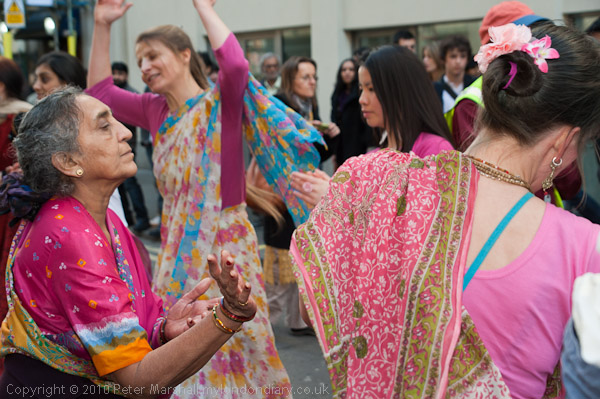
But in particular when photographing the dancing by Hare Krishna, where I was trying to focus on fairly close and rapidly moving subject matter, I found this lens focussed just a little too slow – so much so that I gave up trying to take some pictures. With the 18-105 I would have been able to lock on and follow the movement more readily, and the 16-35 sometimes focusses so fast I don’t believe it has done so.

© 2011, Peter Marshall
Sigma 28-300 at 200mm, 1/200 f7.1 ISO 800

Most of the time I’ve used this lens for relatively static subjects – such as speakers on a platform where I can’t get close, or concentrating on a single face in a static or slow-moving crowd – and haven’t had huge problems. Of course working at around 3-400mm I don’t expect every frame to always be pin sharp, but enough are.

So I got by with one camera, but missed a few pictures because of it, both by having the wrong lens on the camera at times, and also because of the slow focus.

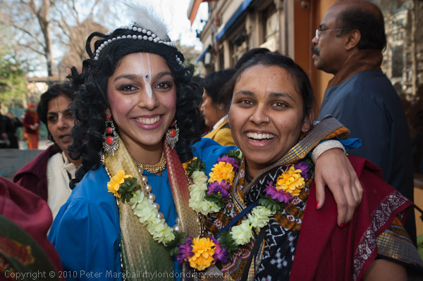
It was a not unusual day in London. I photographed two demonstrations, one with two opposing groups about the Middle East and another about events in Pakistan, and I’d gone to cover another political event but found little or nothing happening there. I’d also photographed a festival of a religious movement with its roots in India.

You can see the results in Ahava Boycott Protests Continue, Hare Krishna Celebrate Gaura Purnima and Repeal Pakistan Blasphemy Laws.

After finishing taking photographs I was going to eat at an Italian restuarant and then watch a French film, but we had to change our plans following delays on the Tube and I ended up eating a Chinese meal in a Korean restuarant, accompanied by a bottle of French wine.

Love on the Left Bank from Dewi Lewis

The 2011 catalogue from Dewi Lewis Publishing (DLP) is worth downloading, if only to see the wide range of work available from this publisher. It includes several books of bodies of work I’ve mentioned here, including some I’ve written about at some length, such as Ed Clark’s Guantanamo: If the Light Goes Out, The Animals by Giacomo Brunelli, Vee Speer’s The Birthday Party and many more.  At least one of those pieces I’ve written I’ve never got round to actually publishing, as I’m still waiting for the promised review copy, having written my piece on what I had seen of the work on show, and there are several others I would certainly have reviewed had I received a copy. But I’m just a blogger?

But one of the greatest services that  DLP has given to the photographic community is through the republication of classic works, and the most recent of these is Ed van der Elsken’s 1954 photo-novel Love on the Left Bank, shot in a documentary black and white style.  There is an interesting review that fills in some of the details, particularly about its star, the Australian artist Vali Myers who plays Ann, a bohemian later described by Patti Smith as “the supreme beatnik chick”  around whom the book revolves.

What too is remarkable at the end of the catalogue is a very small section – I think just 17 books – of out of print titles. With some photographic books now going out of print in the blink of an eye, this reflects a real commitment to serving the  photographic community.

Among the other reissues are a couple of classic works by Martin Parr, including his 1986 ‘The Last Resort‘ which really changed him from a photographer into a phenomenon.  Although I felt the power of the work, it reflected an attitude towards the people he photographed that I felt very uneasy about, lacking the kind of respect I’ve always felt essential.

Also in the catalogue is the book London Street Photography 1860-2010 which accompanies the show opening at the Musuem of London later this week.

It includes the work of well-known photographers such as Paul Martin, John Thomson, Humphrey Spender, Bert Hardy, László Moholy-Nagy, Roger Mayne and Tony Ray-Jones as well as the work of many anonymous photographers whose contribution has been just as important in recording the story of the city.

And also includes the work of over 40 other named and still living photographers, and I’m pleased to be one of them, although like I think most I only have a single image in the book.

© 1981, Peter Marshall
Whitechapel, 1981 – Peter Marshall

My picture has been used in quite a lot of the publicity for the show, and although I’ve yet to see it, one of my friends tells me it one of several images on a poster advertising the show he saw in Piccadilly Circus station the other day. You can see some more from the related series of work in Cafe Ideal, Cool Blondes and Paradise revisited on this site, which also links to a larger set on line. The title actually came from a book dummy I put together many years ago following a workshop with Dewi Lewis on book publishing and I hope to publish a greatly revised version through Blurb later this year.

I’m  looking forward to seeing both the show (open to the public from Friday this week – and I’ll post more about it after seeing it at the opening)  and the book London Street Photography 1860-2010, although the reports I’ve heard on the book so far are a little disappointing.

E3 Grime

Thanks to dvaphoto for the news that Simon Wheatley’s Don’t Call Me Urban! The Time of Grime was published by Northumbria University Press based in Newcastle at the start of the year. I wrote about his work with young Londoners in Lambeth and Bow when Magnum in Motion published a fine audiovisual presentation Inner City Youth, London on his work in 2006  (he joined Magnum as a nominee in 2005, and his work is still on their site although he left in 2008.)

The Don’t Call Me Urban web site is well worth a look, and as well as still images includes a video by Wheatley made on the streets of Bow with some of the ‘Grime’ artists who he got to know and who let him share and photograph some of their lives. The video and his photographs are a very direct and honest look at the lives of these young Londoners, perhaps oddly disconnected from their locale, living in a universe that only connects occasionally with the E3 others know.

January’s  Professional Photographer magazine included an interesting interview with Wheatley about the work and his attitudes, including his need to write a lot of text to put the work into context, something I think some photographers fail to appreciate the need for. Without it work often becomes a voyeuristic enterprise. He also gives some idea of his current situation, living in Calcutta and “looking far beyond photography itself” while also “rediscovering a love of photography.”

A Trip to Kingston: Muybridge Misappropriated?

I think I first became aware of the work of Eadweard Muybridge while I was  in short trousers, on one of the visits we were treated to by two of our maiden aunts to London’s Museums. The Science Museum was only a short trip on the District line away from where I grew up, but London was another world, and one to which my own parents seldom if ever ventured. Back in the 1950s I’m not sure what kind of display the Science Museum in South Kensington had, and my memory of seeing the images of a jerkily flapping bird in flight may well be a later back-projection.

But when I read what is apparently the first published book on him, Kevin MacDonnell‘s ‘Eadweard Muybridge – The Man Who Invented the Moving Picture’ (ISBN: 0 297 99538 3) in 1972, a book whose photographic enthusiasm made up for its many errors,  much of what it contained on his pictures of movement was already known to me from the history books, but the book did fill in many details on his photography as well as more about his extraordinary life. But the real revelation was to see his photographs of Yosemite, Alaska and Central America and to realise what a fine photographer he was.

It was perhaps shortly after that I first visited the display of his work in his home town of Kingston, a few miles from where I live on the edge of London, and was rather disappointed. Some years later we took students to see it at the Kingston Museum and it had I think improved, and as a part of the current interest in his work aroused by the Corcoran Museum show which closed recently at Tate Britain and will be on show again in San Francisco from 26 February to 7 June 2011, Kingston Museum has benefited from a Heritage Lottery grant of almost £50,000 for its own Muybridge exhibition.

Web sites worth looking at  on Muybridge include Stephen Herbert’s encyclopaedic The Compleat Muybridge and the Muybridge Collection on the Royal Borough of Kingston upon Thames web site. But unfortunately although this latter contains much important material, particularly related to his movement work, there is little about his other photography. Their current exhibition (until 19 March 2011) concentrates on his hand-painted glass Zoöpraxiscope discs used in his lecture presentations. Based on his photographs, these are certainly unique artefacts but seem very much a sideshow compared to the actual images published in Animal Locomotion and the Human Figure in Motion (and now animated on screen by almost everyone, including in the past a number of my students.)

You can however view some of the photographically more interesting aspects of his photography from the Kingston collection in the ‘Image and Context‘ section of the Eadweard Muybridge: Defining Modernities site.

© 2011, Peter Marshall
The Stanley Picker Gallery at the University of Kingston

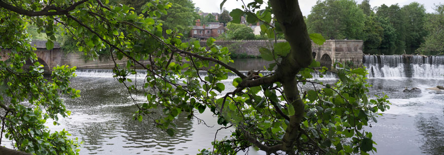
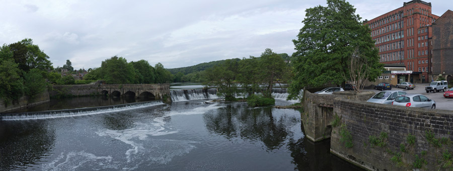
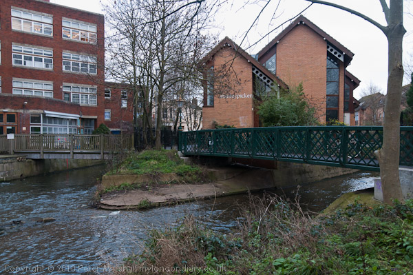
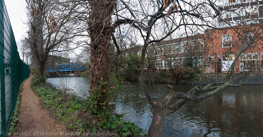
Also taking part in the Kingston celebrations is the Stanley Picker Gallery at the University of Kingston. I have to say that the most interesting part of my visit there was the walk to and from the site, through the streets of Kingston and then back along by the Hogsmill River, one of London’s lesser known streams.

© 2011, Peter Marshall
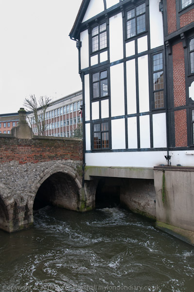
Hogsmill River in Kingston – perhaps London’s oldest bridge, though much widened

© 2011, Peter Marshall
Visitors to the Swan pub on the Hogsmill Walk may be disappointed

The gallery currently contains two works by an artist which are based loosely on Muybridge’s work. One references his 1877 panorama of San Francisco – which can be viewed online in some detail elsewhere (and on the same site there is also an 1851 daguerreotype panorama of the Bay.) Muybridge’s work is remarkable for it’s detail and clarity, thanks in part to the large (indeed ‘mammoth’) plates on which he photographed it, but also to his careful choice of the day when the air was particularly clear. Perhaps too he had learnt something from his previous attempts the preceding year on a smaller – which had been destroyed in a fire. The 13 plates together produce a 17 foot long image covering a full 360 degrees and showing a remarkable precision in alignment.

It did occur to me that a more fitting tribute to Muybridge would have been to host a show of rather more interesting panoramic photography than the two works on show in postcard racks here, which were I think taken in the garden of 2 Liverpool Road, the house where he spent his final years in Kingston, though I think it has changed rather since he was there.

© 2011, Peter Marshall
Hogsmill River at Kingston University – right click and select ‘View Image’  to see larger

The single thing I found most interesting about the work on show in the gallery was the letter reproduced on the final page of the leaflet from David Leigh in California to Borough Librarian Mr Cross on Jan 24th 1949, sending him some information about Muybridge and which in a postscript says “I have read, somewhere, that he was drawing to scale, a replica of our Great Lakes, at the time of his passing.”  This was presumably the inspiration for the work based on the Great Lakes which apparently made use of linoleum, which I also found of little interest.

I can’t however let pass the following error in the introduction to this work:

LINOLEUM Linoleum was invented by Frederick Walton in Staines, England in 1855.

Much though as a resident of Staines I might want to claim any honour it deserves, unfortunately this is just factually incorrect. Staines did have a long connection with lino, and in my youth this was certainly clear to one’s nostrils as you drew near the town, perpetually reeking of linseed oil. But Walton himself wrote to the Technical Director of the first Austrian linoleum company Felix Fritz, the author of ‘Das Linoleum und Seine Fabrikation‘ that he invented linoleum in 1861 (and it is described but not given that name in a British patent of the same year.) At that time Walton was still working in Chiswick, and had no connection with Staines;  it was only in 1864 that together with some new partners he purchased the land on the banks of the Colne there to set up a larger factory to manufacture lino.

Should you wish to read Fritz’s extremely turgid tome there is a copy in the library of the Royal Society of Chemistry at Burlington House, but one of the two existing copies of an edited English edition is on a shelf downstairs, severely abridged and translated pro bono for Staines Musuem by Linda Marshall with considerable (uncredited) technical assistance from myself.

The lino in Staines, long the town’s major employer, celebrated its centenary by closing down around 1964. When we moved to Staines ten years later you could still sometimes smell the linseed oil around the old buildings, then a thriving nest of small workshops and warehouses. Now virtually no trace remains and all we have is a large car park and a bleak boring shopping centre.

This error may not be of great importance, but for me it was symptomatic of a lack of rigour in the work – and was just one of a number of statments that made me think “that’s not quite so.” And a quick check in Google or reference to Wikipedia would have corrected this particular error.

Kington Museum curator Peta Cook told the BBC that she was keen to change the fact that Muybridge although well known in America is not more widely recognised in Britain. They quote her as saying:

“He is London born, and he came back and died here, and this is an amazing collection in Kingston. I would like London to have as much pride in Muybridge as the Americans seem to have.”

I can only agree.

The BBC article suggests the reason for our relative neglect of him is “perhaps because he did the bulk of his work in America.” I have a rather different view. He is neglected here because he was a photographer. And I left Kingston feeling that this very British cultural refusal to acknowledge photography in its own right is very much reflected in the way this current opportunity has been at least in part wasted. Muybridge was a photographer, and a part of a photographic tradition; it’s a pity we can’t celebrate him as such.

Detroit in Ruins

On The Observer web site today you can see a remarkable set of 16 images of ruined buildings – exteriors and intereiors – from the the US city of Detroit, made by two young French photographers, Yves Marchand (b1981) and Romain Meffre (b1987), self-taught photographers from the southern outskirts of Paris.  The illuminating report by Sean O’Hagan that accompanies the pictures, as well as explaining something of the background of the decline of Detroit, the city built on the car industry and once central to the American dream, later the Motown of the music industry, abandoned dream for dread, desertified into an American nightmare, also tells us a little about how the two photographers began this work.

Together they had been photographing abandoned buildings in Paris, and searching the web for more they came across a photograph of Detroit’s Michigan Central train station and immediately knew they had to go and photograph it. They made their first week long visit to the city in 2005, and returned for six further weeks in the next four years to produce a remarkable body of work, published rather expensively by Steidl as The Ruins of Detroit. You perhaps get a better impression of the work from the rather small page spreads on the Steidl page, but the best place to see it is the photographers’ website, where you can also see work from their Theaters project. It’s also worth exploring the ‘Press‘ section on their ‘bio‘ page.

Getting Shirty

To me a shirt is a shirt, and there is something obscene about the images of boxes of what are presumably perfectly decent and serviceable garments being burnt, shown in the pictures that Florian Joye submitted in his entry for the  Lacoste Elysée Prize.

His was the work which perhaps most explicitly linked to the product, with some of the other submissions for the prize frankly performing purely linguistic tricks to link their work to the polo shirt concerned, although a few crocodiles – apparently the nickname of the tennis player after whom the brand is named, and its symbol- do make an appearance, along with the odd tennis court.

But in all the competition still left me with what I consider important questions about the shirts unanswered. Perhaps if I searched on the web site I could find out where the shirts are produced, by who and under what conditions?

The 12 entrants for the prize – Ueli Alder (Switzerland), Kristoffer Axén (Sweden), Benjamin Beker (Serbia), Jen Davis (United States), Florian Joye (Switzerland), Kalle Kataila (Finland), Di Liu (China), Richard Mosse (Ireland), Camila Rodrigo Graña (Peru), Geoffrey H Short (New-Zealand), Tereza Vlcková (Czech Republic) and Liu XiaoFang (China) – were chosen from 80 young photographers taking part in the exhibition reGeneration2: Tomorrow’s Photographers Today, curated by William A. Ewing and Nathalie Herschdorfer, which was at the Musée de l’Elysée in Lausanne in June-Sept 2010.

Each of the 12 selected was given a scholarship of 3000 Swiss Francs (just under £2000) and 3 months to create 3 pictures with a link to the code name of the apparently famous shirt (which of course I’ve never heard of.) The winner, Di Liu, gets the prize of 20,000 CHF, around £12,900. This was the first of what will be an annual competition.

Although I think his work – like the rest –  is somewhat trivial, I think Di Liu deserves the prize, for being the only one of the twelve with a sense of humour and for not including a crocodile in the three distorted animals – a rhino, rabbit and deer – that he plonked down in urban environments.

You can see the work of all 12 photographers on the official web site, one of those annoying web designs that insists on inappropriately enlarging my browser window to fill the whole screen.

Looking at the work, it seems to me that the concept of the prize has resulted in some rather mediocre work, which in a way I find encouraging. The idea of a huge pool of creative talent being harnessed essentially to market a rather ordinary shirt with a peculiar logo doesn’t fit with my ideas of what art or photography should be concerned with. Perhaps in future years Lacoste can be persuaded to a less stultifying approach, supporting creative photography rather than encouraging a kind of second-rate advertising. Some other commercial organisations that sponsor prizes have done it rather better.

France 14 at the BNF & 40 Years of Women’s Lib

© 2010, Peter Marshall
Bibliothèque nationale de France

Later on Sunday afternoon we went on to the Bibliothèque nationale de France (BnF),  and spent some time wandering around on the top of this rather ridiculous building trying to find a way in. Even though we’ve been there quite a few times, it still isn’t obvious particularly when you arrive there from a new direction as we did.

The main show there was Raymond Depardon’s France, and there were longish queues waiting to see it. Fortunately I’d decided I’d seen enough of the Depardon work already, and was probably also familiar with much of the other material, so felt no need to pay and join them. What I was interested in was France 14, curated  by Depardon and previously shown at the 2010 Rencontres Internationnal in Arles , with work by 14 youngish photographers (I think all in their 30s and 40s.)

Having gone through the scanner and having being allowed in to the entrance hall, we looked around for any signs of where this could be and could find none, so I got my ‘interpreter’ to enquire of one of the apparently unemployed uniformed men, but he had no idea either.

We wandered down the corridor past the queue for Depardon and found it was on the walls there, each photographer having a large area of wall to themselves with a numbered board with some information about them and their project. You can read more about the show (in French) and see some pictures in the BnF press release, and there is one picture by each photographer in a slide show on Liberation, but otherwise little on the web about the show, although there is also a book.

The 14 photographers, Jean Christophe Béchet, Philippe Chancel, Julien Chapsal, Cyrus Cornut, Gilles Coulon, Olivier Culmann, Raphaël Dallaporta, Franck Gérard, Laurent Gueneau, Olivier Jobard, Stéphane Lagoutte, Gilles Leimdorfer, Malik Nejmi and Marion Poussier, decided in 2006  to work as an informal group on the project, with each working in their own way on an aspect of the social and geographical representation of French cities and housing estates.

The resulting work was extremely varied, and some of the responses I found much more interesting than others. The Parisian facades by Gilles Leimdorfer, highly detailed and all taken from a direct frontal view, did, despite the text seem to concentrate on the decorative – for example the offices of La France with their sculptural decoraton of the fading advertisements above a Muslim butchers and other shops. While I found the images – like the actuality – fascinating, perhaps the approach was just a little too programmatic for my taste when viewing the whole set of work.

I was disappointed that there were only 3 pictures in Laurent Gueneau‘s ‘Dominante verte‘ but his web site is worth looking at, with a wealth of other images.  Another photographer whose work interested me was Julien Chapsal, and the 15 pictures in his (Où) Suis-je?  – (where) am I? – is very much an investigation of the idea of place (or non-place) in modern suburbia.  You can see for yourself in the images and text on his web site.

Something very different but also enjoyable were the 18 images of Voyage en périphérie by  Cyrus Cornut, images from the new suburbs of the banlieue around Paris. These pictures have an unreal drama, which perhaps matches their typically French architectural flamboyance, although the prints on show at the BnF were slightly less over the top in saturation than those on the web site. Most are seen across sports pictures or with a single sihouetted figure in the background, often at night or dusk.

Perhaps the most intriguing set of work was by Olivier Jobard, who had been sent to Chanteloup-les-Vignes as his first assignment as a young ‘intern’ with the French agency SIPA. A development programme had changed this over a few years from a village of 2,500 people on the Paris outskirts to a small industrial new town with a population of 10,000, including many new immigrants to France, and he was sent to make his report there after an eruption of urban revolt. He states that his work at the time was limited to the habitual clichés of the banlieue – a sick generation, drugs, ghettoism, violence…

Now well known as a photojournalist, particularly for his work in Sudan, he returned to Chanteloup, photographing there again and letting some of the residents tell some of their own stories with his images in ‘Chanteloup. Récits de banlieue‘.

What I did not realise from the BnP show was that he returned there to make a documentary film for the TV channel France 5, along with Fanny Tondre, who was responsible for the video sequences, interviews and text in the programme, which includes many more of Jobard’s still images as freeze frames. It has seven sections; a short introduction is followed be 5 sections, one for each of the people who tell their stories in the project, followed by a brief conclusion. It is worth watching on-line, even if you don’t understand French, with the video sections providing some useful context for a number of fine still images.

The film is a considerably more interesting presentation that looking at the images on the wall at the BnF, not least because it uses so much more of Jobard’s work and the words of the people in his piece – as well as some sensitive filming and commentary by Tondre. What we see on the exhibition wall is little more than a static trailer.

40 Years of Women’s Lib

Finally, before finding (rather by chance) a decent cheap restaurant where we had eaten at on a previous visit just off the rue Mouffetard, we took in another show a short Metro ride and walk away, at FIAP Jean Monnet in the 14e, celebrating 40 years of women’s liberation.

© 2010, Peter Marshall
Armand Borlant at FIAP

Many of the pictures were views of some of the more significant demonstrations  in France by women or about women’s issues (there is a chronology of the movement in French here, and a few pictures here, and a more general survey, also in French, here. Google Translate may help.) Although many of the pictures were taken by women, the group that I found the most interesting were by Armand Borlant, who after working as an engineer in the aircraft industry became the photographer for the magazine Libération, and was later represented by Gamma and was one of the founders of Agence VU.

© 2010, Peter Marshall
Histoires d’Elles at FIAP

Also on show was some more outstanding work from Dominique Doan, photographer for the pioneering feminist publication Histoires d’Elles. I’m sorry I can’t find more of her work on the web.

© 2010, Peter Marshall
Dominique Doan at FIAP

After our meal, we took the Metro again to Montmartre before going back to the hotel for our last night in Paris.  More pictures from our journeys around Paris and from there on My London Diary.

UPDATE:

PARIS PHOTO SUPPLEMENT is now on MY LONDON DIARY