Lightroom 4

I’ve now been using Lightroom 4 for a couple of weeks, and although there are many things I’ve yet to find out, generally I think it is a very useful improvement over the previous version, though I’m hoping it won’t be long before 4.1 is out – and a release candidate is already available. There are a few bugs, but it generally works pretty well. If you are already a Lightroom user, you will almost certainly have upgraded already to LR4, but if not there is no reason to wait. If you are a photographer and don’t use LR,  LR4 means you are missing out more.

LR4 now does almost everything that the digital photographer could want and has become considerably more affordable, while Photoshop becomes more expensive every time I look at the prices.  Very few photographers now really need it rather than the more reasonably priced Elements and if you think you do you are spending far too much time on post-processing and not enough on taking pictures :-) Though I still find my ancient Photoshop 7 easier to use than the much flashier latest Elements. For me it’s a simple basic sharp knife compared to some fancy new toolset that tries to make things easy for those who don’t understand what they are doing. But if I had to I would get used to Elements and get the same results.

LR does take a little time and effort to learn, and that has put some photographers off, but I’d have to agree with another reviewer who noted that their were only two classes of photographers who didn’t like it and use it. Those who had never tried it and those who had played with it for a short time and given up without making the effort.

Perhaps I’d add just a little to that. LR does need reasonably powerful hardware – the difference when I moved from a five year old 32 bit system to my current 64bit machine with roughly 3 times the usable RAM was noticeable, and the change to a good USB 3.0 card reader made a truly huge difference in the time taken to ingest a card full of images into the catalogue – from an hour or two down to perhaps 10 minutes. So if you need to file on location with an underpowered notebook, there are better choices such as Photo Mechanic, though you will probably still want to have LR on you main machine.I’m not sure that the results I’m getting are any better on average than those from LR3, but certainly it is taking me less time to process them, with considerably fewer images needing local modifications (which can be very time-consuming.) The most important changes for me are in the Develop module, where the sliders now work rather differently, even where the names are the same – which takes some getting used to.

LR3 had an Exposure slider and a Brightness one, and LR4’s Exposure slider seems to work rather more like the Brightness in LR3, increasing the brightness of the image without pushing many more pixels beyond the end of the histogram.

The good news is that they have got rid of ‘Fill Light’ and ‘Highlight Recovery’  neither of which really worked properly. Fill light seldom gave good results at values of over 20 and almost never greater than 30, while Highlight Recovery was always best kept at zero (with local highlight areas being taken out by suitable local treatment.) I even  feel a little cheated however, as it had taken me a lot of time and effort to find ways of getting around these limitations and the new version lets anyone do the job properly!

As with LR3, you should work from top to bottom in the Basic panel. The first step seems to be to get the colour balance right, and then mid-tones right (and particularly flesh tones) using Exposure and Contrast.  While in LR3 you then had to burn down excessive highlights locally and get the required shadow detail with a combination of the Fill and local brightness, you can usually get a usable result with the Highlights and Shadows sliders and adjusting the White and Black sliders to fill the whole span of the histogram. The Auto button actually does the job for you more often than not, certainly much more often than in LR3.  Occasionally some local adjustment is still necessary, and often you will in any case want to do a little dodging and burning.

When using the brush or the gradient tool there are some very useful new options – colour temperature and noise, and one that will probably attract any buyers of the Nikon 800E, Moire. The colour temperature is a really useful change, enabling you to deal with images where mixed colour lighting is otherwise a tricky problem.

Also in the Develop module there are welcome changes in the Lens correction, with a better removal of Chromatic Aberration, and when set this this works automatically on any image and isn’t dependent on having a lens profile as in LR3. It’s particularly worth importing old images taken with my compact cameras and using this on them, as well as the Defringe box on the Manual panel of the Lens Correction set to all edges. Along with a little noise reduction it really does improve them, and you can make them almost look as if they were taken with a larger camera.

The Tone Curve is also improved, with much greater flexibility, though it isn’t something I use much. My standard import preset used to give it a little tweak of extra contrast. but in LR4 it defaults to ‘Linear’. When I update images I’ve processed before to the new 2012 process they often benefit from just a little more contrast than this provides, though not quite as much as that provided by going into the Tone Curve panel and choosing ‘Medium Contrast’. If you select this and then adjust the curve to get the effect you want it is possible to save this as a User development preset, but I can’t find a way to add it to the options in the Tone Curve section itself.

There are many more new features (and existing ones of LR3) that I’ve still to investigate. I don’t yet do much printing from LR, but if I did the soft proofing would certainly be useful, and it may be good enough for me to switch to using this in place of Photoshop. Something I am going to try is the new Book module, which can produce either a Blurb book or a PDF. It looks a very easy way to produce image-based books, and appears to handle captions and titles better than Blurb’s Booksmart, as well as allowing you to print a proof copy without an annoying watermark. But for anything with much text – or where you want true flexibility of design – InDesign will continue to be the answer.

In the UK at least it’s actually slightly cheaper to buy LR on disk than download it, a small issue I think Adobe should address. I’m not even quite sure about the legality  involved in charging it’s UK customers VAT at the higher Irish rate, and certainly I’ve had to pay the UK vat rate on some downloads from countries with lower tax rates. But surely they could supply software from a UK server if necessary. Personally I like to have a disk on my shelf, much handier should I have to re-install on this or a replacement computer, and would expect at least a small discount on downloaded software.

Brassaï (Gyula Halász) on YouTube

A Facebook post this morning to a YouTube clip featuring the work of Brassai took me on a short look at other clips about him there and also to reflect a little on how photography should be reflected on screen.

The link was to BRASSAÏ Paris la nuit circuit Brésil and the pictures are well reproduced – and it can even be viewed full screen without losing too much, but you never quite get to see them (or can’t tell if you do.) It shows details and zooms around far too much for my taste; photography is a medium where the frame and framing (or in Brassai’s case, cropping) is truly vital. But the approach does bring over something of the interest and excitement in his work, and I can imagine people watching this and wanting to know more and to really see the photographs, just a shame that they were not shown as pictures before the camera played with them. I also found the music quite unsuited to the work – too staid and stately – and simply had to mute it  after a minute or so to continue watching.

Brassaï, fotógrafo shows his pictures in their entirety, but perhaps not such a good selection, and the quality of reproduction is not as good – it certainly isn’t worth viewing this at full screen.  The soundtrack, ErikSatie’s Gymnopedie No. 1, seems far more sympathetic to the subject matter.  But there are images where it would have been good to zoom in to show details.

Ted Forbes in The Art of Photography talks breathlessly about Brassai and flips over a few pages of the book Paris By Night, but seems to me not to have little real insight into what Brassai was about (or even what photography is about) but determined not to let a microsecond of silence give the viewer time to think. What little Forbes has to say that is worth saying – largely the facts about Brassai – could have been said in a few seconds but he talks throughout at a great rate, as if he hadn’t bothered to write a script. Badly videoed with annoying slips of paper markers covering up some of the pictures and reflections on the pages and you hardly see the pictures. It fails to even show any of his best work. It seems to me axiomatic that in a video about a photographer you should let the pictures do most of the talking and concentrate far less on the presenter.

Another video with a fine musical soundtrack is Brassai with Phillip L Wilcher “CONSOLATION”, and again sympathetic  is Paris by Night (Photographs by Brassaï)  with many of his best pictures shown to the soundtrack of ‘Dark-eyed sister’ by Brian Eno & Harold Budd.

A search on YouTube putting in the name Brassai brings up many more videos, and I’ve already spent more time than I should this morning watching them. If you find a better (or an even worse) one than I’ve mentioned above, feel free to add it as a comment.

Thanks to Diana Sampey for her post on Facebook which led me to the first of these videos. Of course YouTube isn’t the only place you can watch videos. Another that I enjoyed this morning was on BBC News Magazine, where Elliot Erwitt talks about some of the picture sequences in his book Sequentially Yours.

Fuji X100 Firmware Update

Today I downloaded and applied the latest firmware update, 1.20, for the Fuji X100 and although the list of new features in the manual update seems short and unimpressive – the ability to assign the ‘RAW’ button to other purposes, a slightly handier menu position for auto ISO, the ability to zoom in on the focus area in AF-S mode and a playback zoom that may automatically detect faces – the actual differences in operation seem a little more impressive.

Fuji do actually give a slightly longer list elsewhere, where the earlier improvements in previous firmware updates are also listed. But somehow the camera just seems a little ‘snappier’  (sorry:-) and even the start up delay seemed a little shorter. Or perhaps I was just imagining it. Perhaps it was just the good weather (and a little good wine) that made everything feel better.

But it’s certainly good news that Fuji are continuing to improve what was from the start a fairly impressive camera in most ways. It’s interesting to see how the DxOMark ratings for this camera compare with those for the Leica M9 – which it outranks on every score, if not always by a great deal. My own experience puts it between the Nikon D300 and D700 for overall quality and also for use in low-light, and the DxO figures are also in agreement with this. Of course with a fixed lens it is limited in some ways compared to these other cameras.

But perhaps the most surprising of DxOMark ratings I’ve seen are those recently published for the D800, with the highest score of any “35mm” camera and which put it up into the large-format league. Most surprising of all, and something that has wrong-footed most of the pundits is its low-light rating, more or less the same as the D4 and only slightly below the leading D3S.

BJP, Sensor Size & Book Design.

My eyes widened somewhat when I read on the BJP site that they were reviewing a new “large-sensor compact” camera from Canon. Was this something I had missed elsewhere? I didn’t get to read the feature, which was part of their “premium content” and I cancelled my subscription to the magazine a few months after it went monthly and haven’t yet found a reason to take it up again (perhaps I’ll think again if I ever get an iPad.)

But I immediately went and looked up the camera concerned, the Canon Powershot S100 on Digital Photography Review and found that what I had missed was simply a re-definition of the term ‘large-sensor’. The S100 has ‘a 1/1.7″ format (approx 7.5 x 5.5mm)’sensor, with an area of 41.35 square millimetres, under 1/10 of the area of a large sensor as I know it such as the Nikon D300, and 1/20th of the D700.

I like the reviews in DPreview for their detail and care, and you know exactly what you are getting. Like all camera reviews you need to think about the aspects that you would find important in a camera, and your priorities as a photographer (or at least mine) are probably very different to those of the reviewer. Their reviews give you a lot of evidence on which too base an opinion of whether the camera concerned might be one that would work for you.

BJP’s style of review in the past was far more idiosyncratic, and what you got was largely one working photographer’s opinions, rather like asking a mate about his camera, though with a little more detail thrown in. Usually they were written by people with considerable experience in the field at which the camera was aimed, and I often found them enlightening, though there were times when I found them way off beam.

Of course I can’t tell you what they thought of the S100, which appears to be a pretty decent compact camera so long as you are happy with sticking to low ISOs. But if you want something which will keep up with large-sensor cameras when the light gets dim, forget it. It’s a camera I might consider for those times when I can’t be bothered to carry a camera. If you’ve not noticed, DPReview have recently posted their first impressions of the Nikon D800, which also make interesting reading. As they say, ‘You may be surprised by the outcome.’

Worth a look on the BJP site is a feature by someone rather better-known on line, Jörg Colberg (of the Conscientious blog), Better by Design: The role of design in the making of five modern photobooks, which looks at Alec Soth’s ‘Broken Manual‘, ‘Redheaded Peckerwood‘ by Christian Patterson, Christopher Anderson’s ‘Capitolio‘, Geert van Kesteren’s ‘Baghdad Calling‘ and Andrej Krementschouk’s ‘Come Bury Me‘.  None of them are books that particularly appeal to me, and perhaps their design has something to do with this.

Colberg quotes Dutch photobook designer Hans Gremmen as saying “Everything should always be tailored to the book. If this is done well, the reader probably won’t even notice because all the details will work as an organic whole” and I can only agree, but what all these works have in common is that exactly what I notice is the design, and for me it gets in the way of looking at the photographs. (It’s probably also true that I don’t in most of them find many photographs of particular interest.)

The five books chosen seem to be books that are somehow trying to pretend they are not books, breaking away from the generally accepted conventions of book design for the sake of it. There is much to be said for keeping photography books simple and straightforward.

Trespassing on Gallery Walls

As always, Shahidul Alam writes a thoughtful article on photography in his Trespassing on Gallery Walls in which he looks at the peculiar nature of the photograph that empowers it. Something that means that as the art world ingests our medium, “It has led to concerned photography being considered passé. In the hallowed world of limited-edition copies, the fine art print is about the object and not its purpose. Form triumphs over content.”

As he goes on to point out, photography has at times altered the course of history, changing people’s views – and regimes such as that in Bangladesh continue to provide evidence of its power when they close down shows such as “Into Exile: Tibet 1949 to 2009” and “Crossfire”. But do read his article, written as the introductory piece for the February issue of PIX, a photographic quarterly from India, where you can download this issue on the theme of Trespass. It contains some fine work, and I particularly enjoyed the black and white essays by Mark Esplin, Siddhartha Hajra, Aparna Jayakumar and Devansh Jhaveri.

Esplin’s digitally taken diptychs in City Builders (2010) pair portraits of New Delhi’s homeless with night images from the streets of the city. Hajra in ‘Opera Monorama‘ has photographed the performances of “Monorama or Rajuda (as he is commonly called in his neighbourhood)… a transgendered person who ‘performs’ in closed community spaces during the spring season which is associated with Sitala puja.” It is sensitive and intriguing work. Jayakumar in ‘On the Wrong Side of the Equator” is working in the surreal world of the film set, a Bollywood recreation of an Angolan hamlet in India. Jhaveri in Trespass looks at the Hindu cremation rituals.

In his piece, Alam makes reference to the “amateur grabs of Abu Ghraib“, with which we are all familiar, but an earlier  – and  non-photographic post on his blog, Control by seed, written by Najma Sadeque, is about a far more serious grab which occurred at Abu Ghraib, the home of Iraq’s national seed gene bank.

Under the control of Paul Bremer, military head of the Provisional Authority in 2004, Order 81 dealt  with plant varieties and patents. It allowed plant forms to be patented and genetically-modified organisms to be introduced. Farmers were strictly banned from saving their own seeds. Its “goal was brutally clear-cut and sweeping — to wipe out Iraq’s traditional, sustainable agriculture and replace it with oil-chemical-genetically-modified-seed-based industrial agriculture.”

As Sadeque writes: It’s not for nothing international researchers have termed the deliberate annihilation of Iraqi agriculture the ‘ultimate war crime’.

London’s Overthrow

London’s Overthrow is a very different diary of London in Nov-Dec 2011, superbly written by China Miéville, part of which was featured in the New York Times, though their piece lacks the unity of the full work, which includes Miéville’s mobile phone images. In the NYT the text was accompanied by the very polished and polite images taken by Mark Neville for The New York Times. Although these are fine in their own way, and would look good perhaps in some company annual report or government document, they really have no point of contact with the visceral anger of the text. 

Miéville’s images may sometimes be blurred and indistinct (in one example beyond the limits of legibility) but their emotion matches the piece splendidly.  The NYT presentation is an unholy marriage that traduces both writer and photographer, an example of blatant visual illiteracy, an exhibition of stunning incompetence that should be a hanging – or at least a sacking – offence for the picture editor concerned.

My own My London Diary, as well as my work over the years elsewhere, touches on some of same events and themes that Miéville, though in a my own rather more reserved register.

© 2011, Peter Marshall
London in November 2011 – more on My LondonDiary

© 2011, Peter Marshall
and more from December 2011 too.

Lea Valley 7 Mervyn Day 1

What Have You Done Today, Mervyn Day? is a film made by pop group Saint Etienne with director Paul Kelly in 2005, as a farewell tribute to the Lea Valley, just condemned to disappear. Filmed over a couple of months, this story of a wandering paper-boy (named after a West Ham goalkeeping legend) getting lost in an often dreamy lower Lea landscape is set on the day after the announcement that London has won the Olympic bid – July 7, 2005 – also the day of the London Bombings.

© 2004 Peter Marshall
Photographs in this post are from the Lower Lea around 2004-5 by Peter Marshall
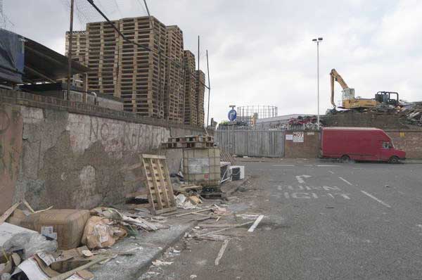
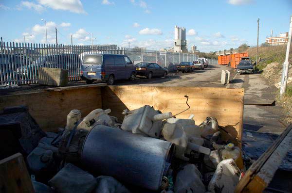
Palletts and scrapyard at Canning Town.

So many of the images in the film are familiar to me, and it ranges fairly widely over the whole of the Lower Lea, occasionally jumping several miles at the turn of a pedal. It’s not of course meant to be topographically accurate, but to those of us who know the area it can be a little disconcerting, and there are a few pictures which actually show the River Thames that might mislead some into thinking the Lea becomes rather grander than it does. They seem to have pretty thoroughly combed the area from Bow Creek to Hackney Wick with a few trips further north in their search for images.

© 2004 Peter Marshall
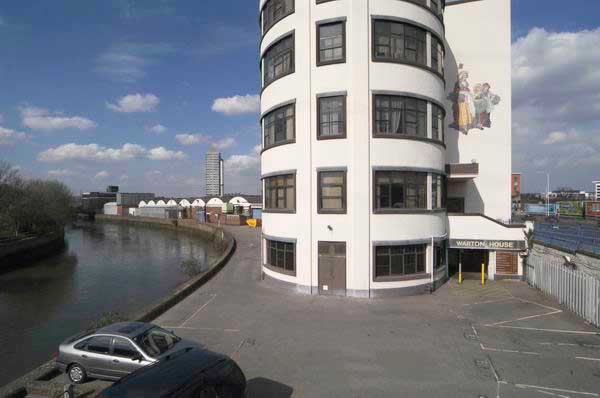
Waterworks River and Warton House, Stratford High St
© 2005 Peter Marshall
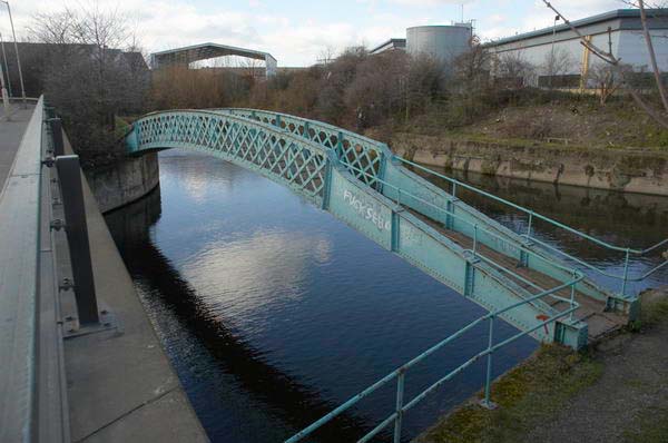
F**k Seb Coe graffito on footbridge over City Mill River as it leaves the Old River Lea

The pictures and script – with voices playing the boy’s mother and father give a good feel of the history and community of the area, although again a few incorrect details grate.  For example, the River Lea does definitely not start at Ware (but at Leagrave or close by at Houghton Regis), though perhaps this misstatement was meant to reflect what is a general lack of knowledge – even by those who live there – about the Lea valley, which isn’t really a concept for most of the population.

The music isn’t bad either, and the track list apart from the title track and and Mervyn’s Theme – Sugarhouse Lane, Hope Chemical, Eton Manor, Quartermile Bridge, Cosy Café, Lee Navigation, Pudding Mill Lane, Channelsea, White Post Lane, The Pylons, Parkesine, Lesney Factory, Swan Wharf, Pioneers, Trinity Wharf, Blackwall Reach – could more or less have  taken from my captions and is a tribute to the real star of the film, the Lea valley.

© 2004 Peter Marshall
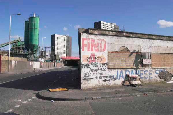
Carpenters Rd and Warton Rd

Thanks to Tim Soar,  a fine architectural photographer with studios in the Wick, for pointing me towards a full version of film – around 48 minutes – available on the web at Bambuser.com, which has resulted in me failing to do much work this morning!

There are also excerpts from the film at other sites. It’s a film you listen to for the music and watch for the views it gives of the area, although perhaps it overworks both the extreme telephoto and close-up detail, with too little of the kind of distance and context I like in my image above – and a part of that wall is in the film.

© 2005 Peter Marshall
Marshgate Lane

© 2005 Peter Marshall
East Cross Centre, Waterden Rd

The film is really a great snapshot of the lower Lea Valley at a particular point in time (though with a rather pointless narrative imposed on it, and the uncut footage could perhaps yield more.)  And as illustrations to this post I’ve included a few of my own pictures from roughly the same period. You can see more on my River Lea/ LeaValley site, or in my book Before The Olympics (it can be viewed in full in the Blurb on-line preview.)

© 2012, Peter Marshall
Wick Lane

In April, the Museum of London has me running a workshop based at the View Tube overlooking the Olympic site, Art of …photography: Stratford and the Olympic Park, and I spent some time today planning it. Booking has only recently opened and there are still plenty of places left on the course which is on April 21-2.
________________________________________________________

My London Diary : Buildings of London : River Lea/Lee Valley : London’s Industrial Heritage

All photographs on this and my other sites, unless otherwise stated are by Peter Marshall and are available for reproduction or can be bought as prints.

To order prints or reproduce images

________________________________________________________
Nokia 808 Pureview

Could my – or your – next camera be a phone? Certainly the Nokia 808 Pureview looks a fairly amazing piece of kit and the sample photos are impressive, certainly for a cameraphone. Of course we don’t need 41Mp, but by combining pixels to give 8Mp or 5Mp image output the Pureview is able to get better quality, as well of course giving it the ability to digitally zoom at decent quality. The zoom stops when the area of the sensor it covers has the number of pixels for the output.

So starting from 41Mp and reducing to 8Mp means going down to 8/41 of the sensor area, which I think gives a linear zoom of 2.26 (the square root of 41/8) while with a 5Mp image the corresponding zoom is 2.86, neither huge. The roughly 28mm equivalent f2.4 Carl Zeiss lens becomes a 28-63mm or  28-80mm respectively, which isn’t too bad, but the system really comes into its own with smaller image sizes. It will also have the slightly odd effect of quality being significantly better at the wider end of the range, and I imagine this will become pretty noticeable at higher ISO.

Of course 28mm for the 4:3 format (26mm for 16×9) isn’t particularly wide, and this is one reason why this won’t be my next camera. But it does seem to represent a real breakthrough in camera-phones, although it won’t be my next phone either, as I think it’s Symbian operating system is one to avoid, but perhaps with their next model it could really become the camera I’d take with me when I can’t be bothered to carry the real thing.

D800 Announced

I imagine like many photographers my first reaction to Nikon’s D800/800E announcement was ‘Oh No, who needs 36Mp!’ or something rather less polite, but thinking a little more about it I’m not so upset, particularly as it offers a 15.4Mp DX option.

I’m also very pleased that at last Nikon have introduced a new Auto ISO system that relates the minimum shutter speed to the focal length in use, something I’ve long suggested –  since before cameras had auto ISO.

Other useful improvements appear to include a better LCD monitor and USB 3.0, though I’ve already moved over to faster transfers simply by using a USB 3.0 card reader. And certainly some with be pleased with the video, though it isn’t something that greatly interests me at the moment.

Of course my first reaction on hearing about it was to go to the ‘Hands-on Preview‘ on DPReview, much easier to read than Nikon’s own pages, and giving a little more idea of what it might be like to use. But as always it will be some time before any proper reviews that actually give us the details and in particular the performance of actual production cameras emerge.

But despite what Nikon calls its ‘light weight and compact size’, at 146 x 123 x 81.5 mm (5.7 x 4.8 x 3.2 in.) and 1,000 g (2 lb 3.3 oz) with battery and SD memory card it’s rather too big and heavy for me, more or less the same as the D700 I already have which is still working well, and which I don’t really have a need to replace. If I could persuade myself I could work with a single camera, I’d think much more carefully about it, as the ability to switch to DX mode and still get good size files would make a lot of sense. That 16-35mm would double as a 24-47mm as well as being able to use my existing DX lenses – such as the 10.5mm on the camera. Perhaps when I see the full reviews I’ll decide I can and get one to replace both the D700 and ailing D300.

But for the moment, I think I’m waiting for later in the year when perhaps we can expect the D400 (or whatever Nikon decide the D300S replacement should be called) – possibly to be announced in March, though likely rather later in the year. We may also see a replacement for the D7000 which might also be possible in place of the D300.

Nikon do rather seem to be making the running in DSLRs at the moment, just a shame they haven’t produced a serious competitor in the mirrorless class.

The Near and Elsewhere

Although The Near and  The Elsewhere, showing at the PM Gallery in Ealing was in various ways a disappointment to me, I was still pleased that I had gone to see it (and it remains on show until 17 March, Tue-Fri 1-5pm, Sat 11-5pm) and would recommend a visit if you are in London – it’s a short walk from Ealing Broadway tube.  Firstly because of the setting, in a 20th century extension of Pitzhanger Manor-House, once the country home of Sir John Soane who rebuilt most of it between 1800 and 1810. It’s a splendid building and well restored, owned by the London Borough of Ealing, and looking quite dramatic when I arrived there in the dark for the opening. Just along the road from Ealing Studios, it has its own film history having starred as the Tate Gallery and Kensington Palace among other places, even appearing in Doctor Who.

Inside, the gallery is a fine large space and perhaps demands some at least of the large images that are on display, although for me most of them were rather lacking in interest. My first disappointment – a minor one – on hearing about the show was to find that it had no connection with the blog of the same name. The second, on reading that it “shows the physical growth and loss of urban architecture in cities across the world” was to find that photographers who would have been at the top of my list for addressing such issues were almost entirely absent. And thirdly, on looking around, I found that much of the space was taken up with frankly boring art works many on a very large scale. But fortunately there were still some things worth looking at, and others will have different interests to me. I’m a photographer after all.

My favourite picture was one of Ferit Kuyas‘s images from his ‘City of Ambition‘, a project taken in Chongqing, the largest city agglomeration in the world with a population in the city of around 32 million. It is a view looking down from a height on a construction site, taken in 2005 with the slight mist seen in many of his images of the city which he tells me is not pollution but the fog that the city is famed for. It’s a wide angle view and the site is packed with small details; as you look at it gradually you realise more and more men are working on the site. Although it is quite a large print, 100x125mm, I found myself walking right up to it so I could see details with my reading glasses, then moving back to take in the whole picture. This is an image you can look at for a long time and still find new things in.

His other work in the show, Jialing River Shore, a diptych of a vast concrete space, reminded me of some images taken underground in vast reservoirs and comes from a couple of years later, when he was deliberately avoiding including a horizon in his images. The two pictures are views made from the same place but looking in different directions, with a part of the subject repeated on both (they are mounted together as a diptych in the opposite way round to the view.)  There is a pleasing subtletly about the printing that was absent in some of the other works on display. Both of these works are in his book ‘City of Ambition‘ but neither seem to be on his web site, which does however have a fine selection of his work from the project.

One of Michael Wolf‘s distant views of Hong Kong’s blocks of housing was another impressive image, and I quite liked his 100×100, a set of 100 pictures of the residents of cramped 100 square feet single room homes in Hong Kong, a contrast to most of his images which are devoid of people. The relatively small images from this project are shown displayed as a tower block in a corner of the gallery, which works as an idea but does make actually viewing the upper images rather tricky.

Another interesting set of work was One million $ houses by Noel Jabour, showing buildings “turned into redundant monuments to greed” through the failed US mortage economy. These structures, like many of Kuyas’s images of Chongqing, emerge from the Galveston, Texas sea mist, giving them an air of unreality that mirrors the financial unreality which created them.

The invitation carried a dramatic image of a Shanghai house by Canadian photographer Greg Girard, whose book Phantom Shanghai captured the ruins of the pre-war international city, and were taken in 2005 just before (or as) they were being demolished, with highly theatrical night lighting and garish colour that somehow works. This was a pretty vast print,  210 x 180cm, and one of very few very large photographs that really merits its scale (and certainly the only one in this show.) The images are well reproduced well in his book, but ‘Rags, One Room Apartment, Liyang Lu, 2005′ in the print on the wall had one of the worst colour casts – a strong cyan – I’ve ever seen in an exhibition; it is unrecognisable as the same image in the book (and may perhaps be from another exposure made with different lighting.)

Girard’s book has an foreword by William Gibson, but it was another book, J G Ballard’s Empire of the Sun, that came to mind, and these pictures can truly be described as Ballardian, and I’ve just bought a copy on-line. Incidentally you can see a good set of Girard’s pictures on today’s New York Times Lens blog of US bases in Japan, Korean and on Guam, taken in 2008 – and this and more work on his web site.

I think Gregor Graf‘s work looks better on the web than on the wall; by digitally removing all signage and people from his pictures of cities he creates strangely alien places. Linz, in his Hidden Town – Situation 2, 2004 could be London or Warsaw, but the lack of textures makes it more than anything else resemble a cardboard model of a city than the real thing. Its a curious but perhaps just slightly more interesting reversal of those artists who build elaborate models to photograph.

Also in the show is work by Francis Alÿs, Sarah Beddington, James Casebere, Thomas Demand, Edgar Martins, Gaia Persico (who curated it), Peter Piller, Sara Ramo, Rachel Whiteread, and Cino Zucchi Architetti.

The gallery also has an interesting complement to this show in the small and almost monochrome paintings based on her recent photographs of small town America by Marguerite Horner, ‘The Seen and Unseen’ (closes 25 Feb) which I enjoyed seeing. It very much reminded me of the work made in similar places that formed a bedrock for much American photography of the last century, through  Wright Morris, Walker Evans, David Plowden and others to Robert Adams.