I’m trying hard to remember when I last took a black and white picture, and I think it must be more than ten years ago, though I do still have a few rolls waiting to be processed.
I spent around thirty years taking most of my pictures in black and white (though I often also worked in colour) . Many if not most of my favourite images, both my own work and that of other photographers is in black and white, but somehow I no longer feel any urge to work in black and white.
It would of course be easy to do so. A simple click of a mouse would convert the images taken in any of my digital cameras from colour to monochrome, but it’s something I dislike doing. Occasionally I’ve carried out this conversion, in the past using specialised Photoshop plugins (though now Lightroom has some good monochrome profiles built in) but generally only when my colour pictures are going to be reproduced in black and white – when I prefer to make my own conversions rather than leave it to others.
When I made the mistake of buying a Leica M8, there were some occasions where the colour was simply so wrong as to be unusable (though I spent hours trying to put it right with various software programs) and the only way to use pictures were as black and white. And while it was a lousy colour camera, it was actually pretty good as a black and white camera and perhaps I should have kept it for that. Later of course Leica did produce a monochrome model.
With mirrorless cameras you can even view the world in black and white, which might be an interesting way to work, though I’ve yet to try it for more than one or two test exposures. But generally I’m rather averse to converting images taken in colour into black and white and think most people who do so produce work that is unconvincing. You have to think differently to make good monochrome images, try to think tone instead of colour, and pay greater attention to shape, line and form.
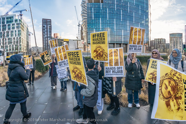
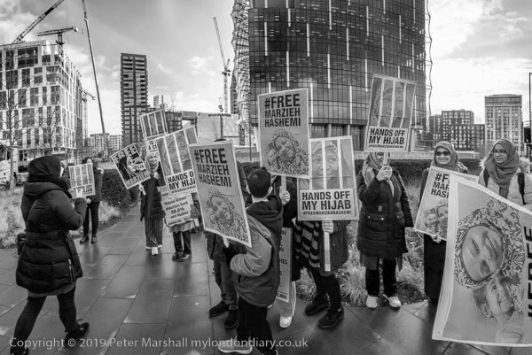
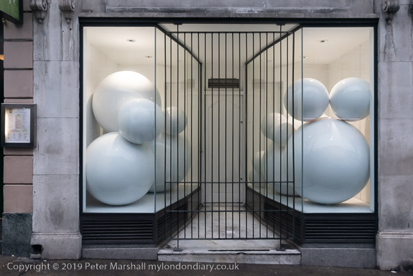
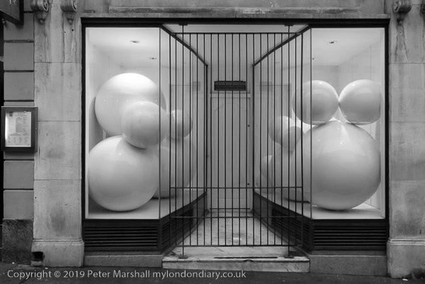
I just spent ten minutes or so looking through some of the more interesting pictures I took earlier this year, looking for images that might possibly have worked in black and white, and coming to the conclusion that colour was essential for almost all. For this post I’ve picked a couple that I thought might work as well or better in black and white and made the conversion. I’ll let you judge – and please feel free to comment if you have a strong preference.
I was prompted to write this post by reading one on PetaPixel, What Shooting Film Taught Me About Black-and-White Photos by Ellie Cotton – I think it looks better on her own web site. I actually think all of the pictures in that article look better in colour, though a couple convert reasonably to black and white.
There are no adverts on this site and it receives no sponsorship, and I like to keep it that way. But it does take a considerable amount of my time and thought, and if you enjoy reading it, please share on social media.
And small donations via Paypal – perhaps the cost of a beer – would be appreciated.
All photographs on this and my other sites, unless otherwise stated, are taken by and copyright of Peter Marshall, and are available for reproduction or can be bought as prints.
To order prints or reproduce images
Tags: black and white, colour, converting colour, photography