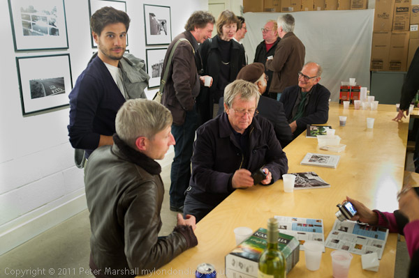
Towards the end of the evening when most people had left it was truly an elite gathering
Magical. It was for me at any rate, though adrenaline and alcohol are always a heady mix. Although our opening last night at the Shoreditch Gallery/The Juggler was never particularly crowded, there was a steady stream of people coming to see the show and pay their respects before moving on to one of the many other openings. First Thursdays are often busy, but this one especially so, as it was also the first Thursday of the UK’s largest photo festival, the East London Photomonth.
I’d had several apologies from photographers who were out of the country – and had to send my own to several who were at their own openings elsewhere across London. But among those who came to the opening were a good cross-section of the better photographers of the capital, as well as other friends who we were also pleased to see.
Even after we’d left the gallery – well after the agreed closing time – and a small group of us were talking outside, another dozen people turned up to look at the work.
As well as the 12 pictures I had on show, I’d also taken along the book ‘Before The Olympics‘ (and some others) with another 250 or so pictures from the Lea Valley. As several people pointed out to me, the reproductions of the pictures on the wall in that volume were considerably less subtle and less rich than the prints on the wall. Although Blurb, especially using the more expensive premium paper, does a reasonable job, it can’t match either a good darkroom print or a good inkjet print.
The prints I had on the wall were all made using Epson Ultrachrome K3 inks on Ilford Gallerie Gold Fibre Silk, and it is a very good combination. I’ve experimented with printing from the R2400 using just the three black inks in the K3 set (photo (gloss) black, light black and light black) which you can do using the Bauhaus Rip (or presumably with the Quadtone Rip) and although the results are good in terms of tonality, the prints have a slightly unhealthy looking greenish black in daylight. The best results I’ve acheived with this ink/paper combination come from using Epson’s own ABW (advanced black and white) mode, which allows you to alter the print colour and uses a small amount of the colour inks along with the three blacks.
I’d printed the set using the same print colour settings, and under daylight they were a pretty good match, but in the gallery lighting there were some noticeable differences in tone. I suspect this comes from different light bulbs (or perhaps just different ageing of bulbs) used in the display lighting. Some had a slight magenta to the black which fellow exhibitor Mike Seaborne tells me is normal for the Epson inks under tungsten lighting, while others were if anything more neutral than in daylight. I didn’t find the differences a problem, although Mike prefers to use HP printers as he says their inks exhibit little or no metamerism.
Back in the 1980s I printed these pictures – and all my best work on Agfa papers, mainly Agfa Record Rapid, which had something of a cult status among photographers (and which the late Peter Goldfield set up a company, Goldfinger, with premises above his Muswell Hill pharmacy to import) and occasionally the rather warmer Portriga Rapid. But Record Rapid (and its Portriga cousin) had to change its formulation to cut out the cadmium in the nineties, and the new version was simply not the same. I moved to using Ilford papers, which were fine, but no match. Probably the next prints that I was truly happy with were on matte papers such as Hahnemuhle German Etching and Photorag using Piezotone inks from Jon Cone. They weren’t Record Rapid but had a rather different quality of their own. Now with newer semi-gloss papers – such as the Ilford Gold Fibre – I can get prints which, with the advantage of the precise control offered by working with scanned digital files, are usually even better than those from the old days. Though RR could have a depth and a pearly opalescence that was only ever surpassed in the very best (and rather rare) examples of carbon printing.
The night also brought home again one of the small design faults of the Fujifilm FX100, the rather light detent on the exposure compensation dial, which is also perhaps a little too conveniently placed at the back right corner of the top plate. With a fewer glasses of Merlot I would certainly have realised that I was working at +2 stops and avoided the overexposure that ruined most of the images. And +2 stops when working at full aperture makes for long shutter speeds, so pictures were blurred as well as overexposed. But I hadn’t gone there to take pictures and wasn’t giving it my usual attention, so there are rather fewer images in this post than I would have hoped.